

Ocean Line
Freight.
01. Executive Summary
High-Level Clarity.
Ocean Line Freight is a global shipping powerhouse. I was tasked with unifying their disparate regional identities into a single, authoritative global brand. The new architecture projects maritime stability and horizon-scale logistics, leading to a 25% increase in cross-border contract acquisitions within the first year.
02. Context
Situational Awareness
In global logistics, trust is the primary currency. Ocean Line Freight had grown through acquisitions, resulting in a fragmented visual language that made the company look smaller and less organized than it actually was to international port authorities.
03. The Core Problem
Problem Definition
The previous identity felt regional and "dock-side" rather than international and "horizon-scale." It failed to communicate the digital sophistication of their real-time container tracking systems and their commitment to sustainable maritime fuels.
04. Constraints
Risk & Trade-offs
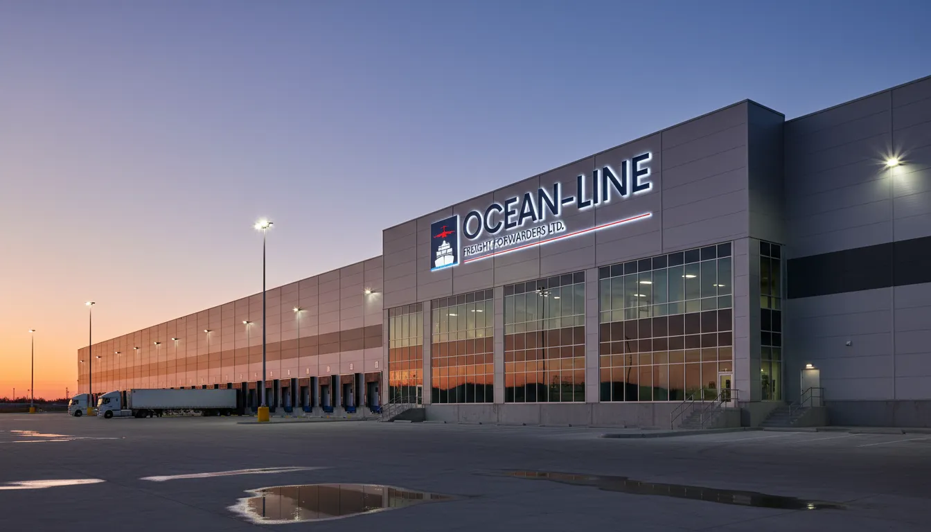
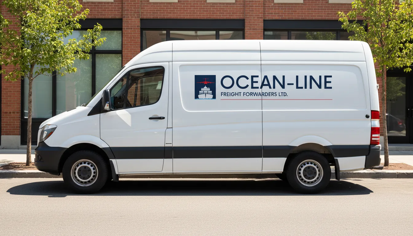
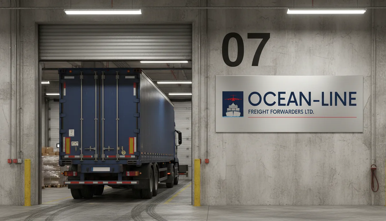
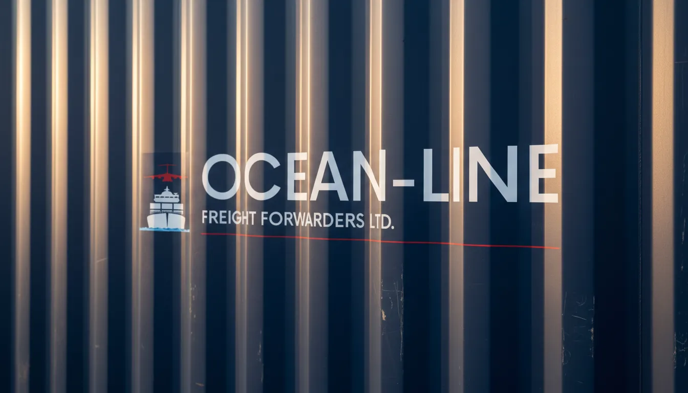
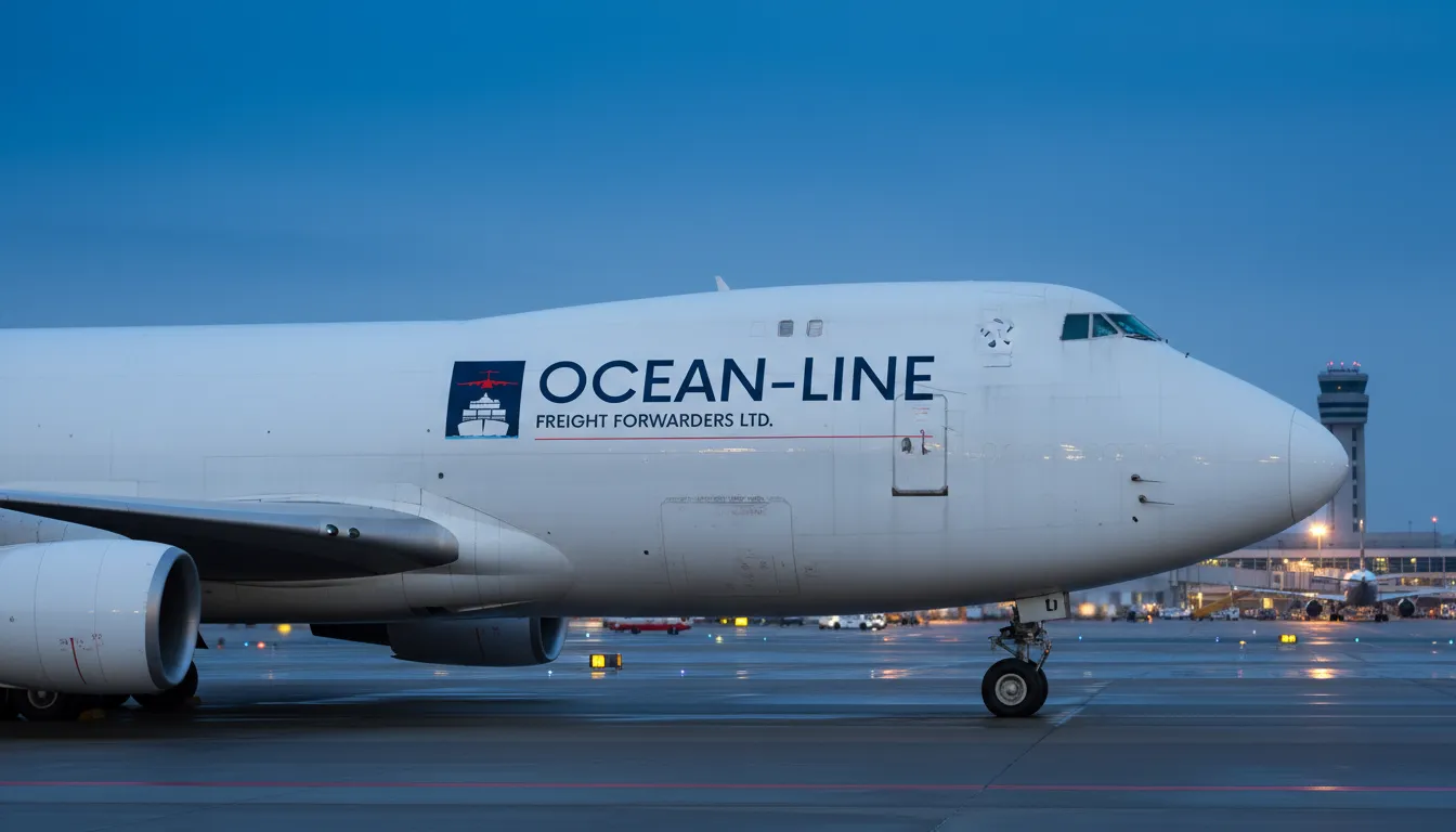
The identity had to be highly visible on steel shipping containers, which are often rusted, dirty, and viewed from extreme distances. We had to work within a 3-color palette maximum to keep container painting and decal costs scalable across 50,000 units.
05. Objectives
Success Criteria
Develop a "Horizon Authority" aesthetic. Success was measured by the successful implementation of the brand across all global offices and a qualitative survey showing increased trust from tier-1 freight forwarders.
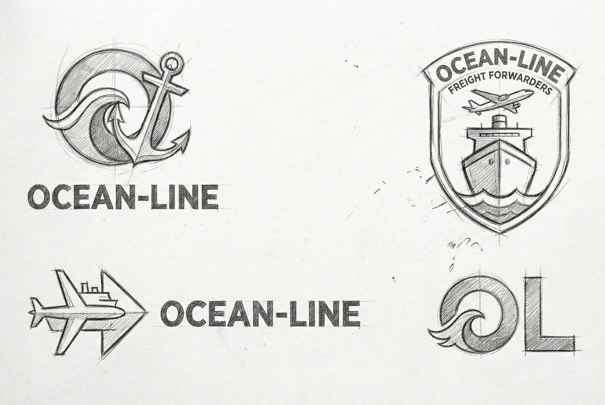
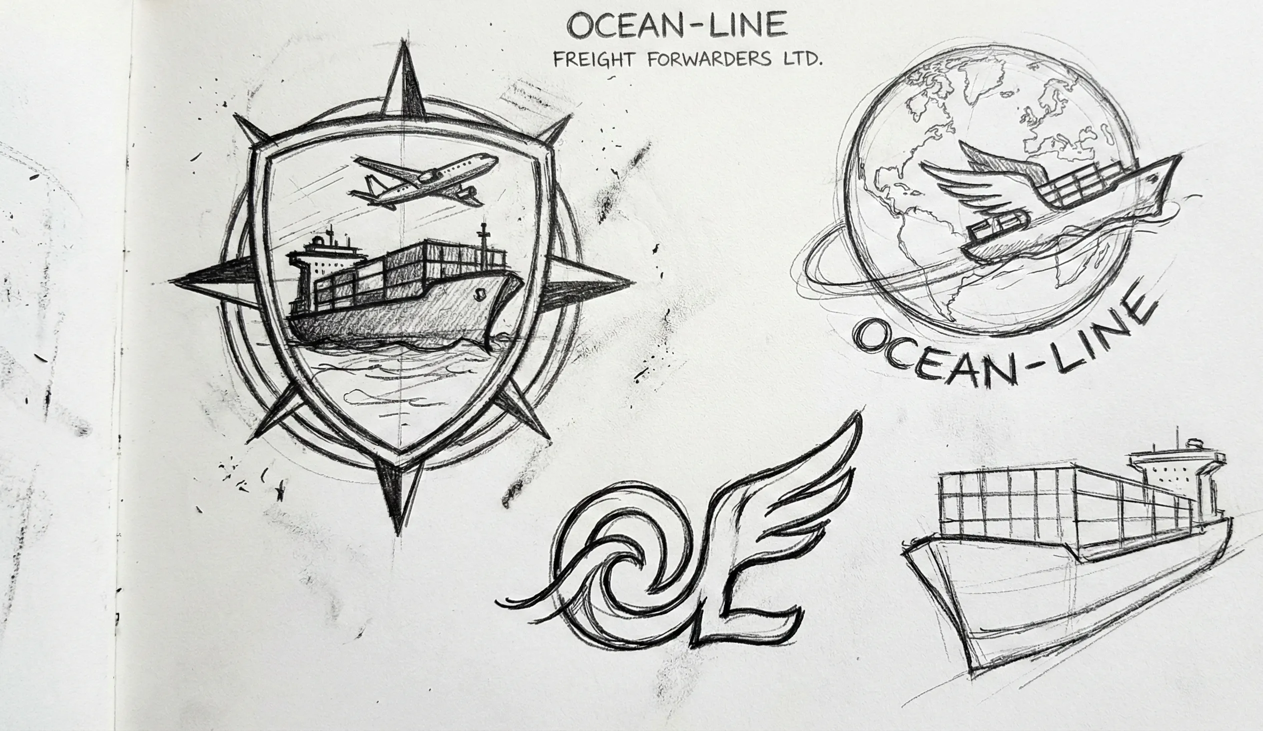
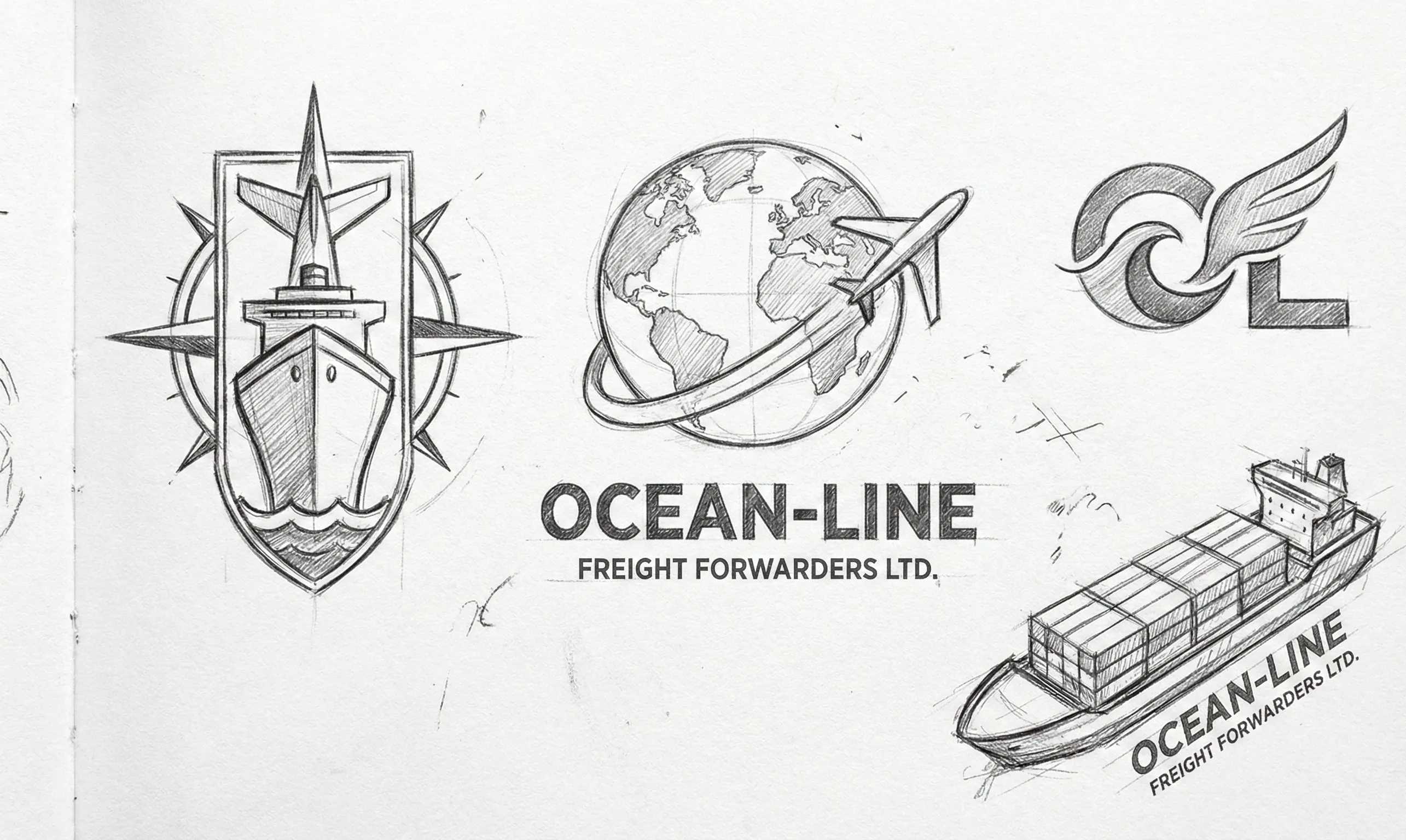
06. Strategy & Thinking
07. Design Decisions
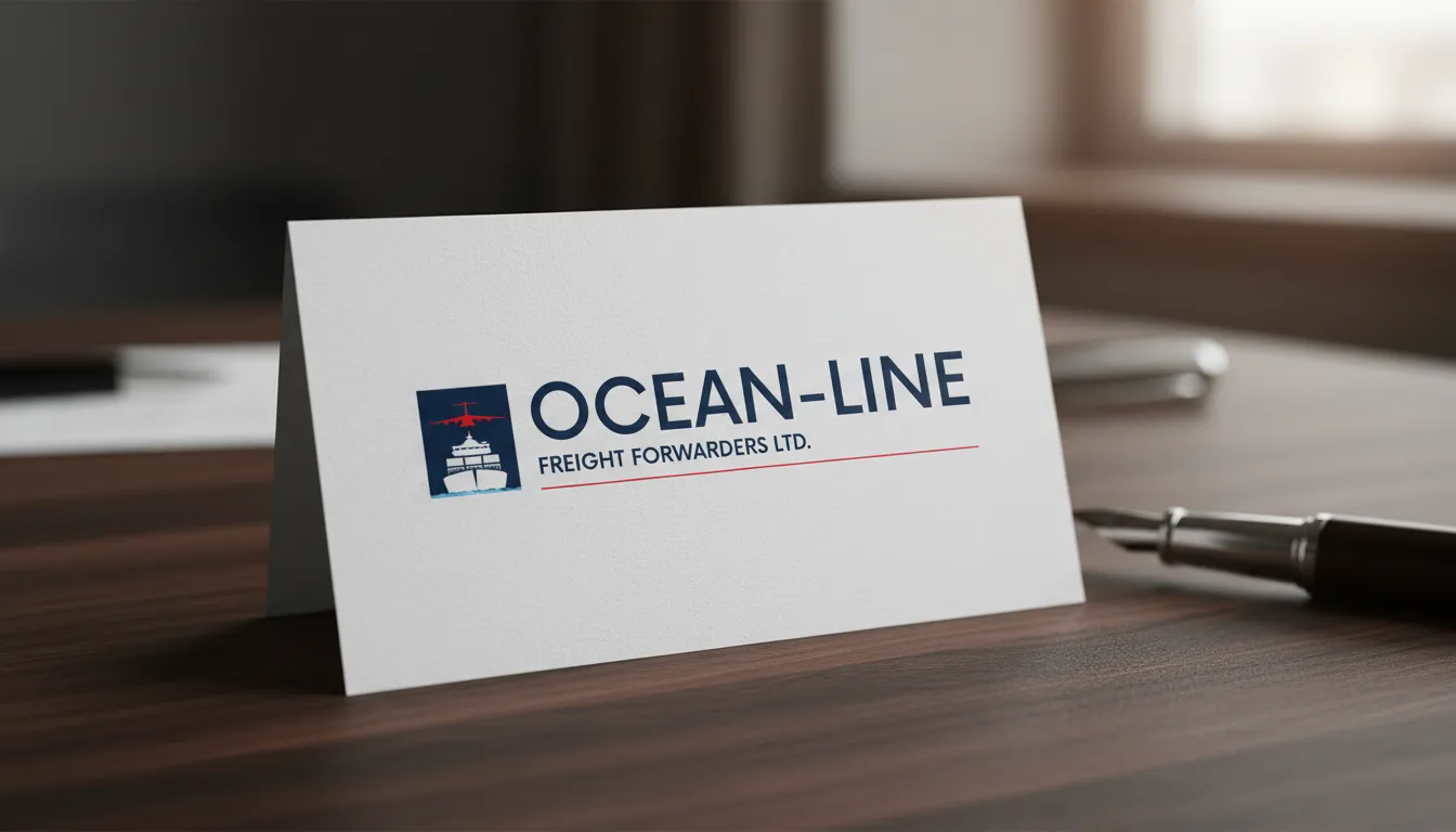
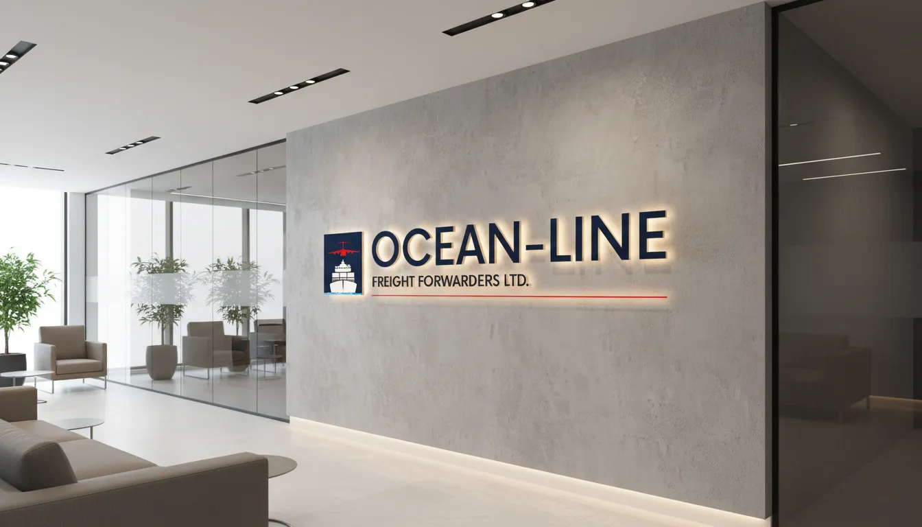
Global Authority.
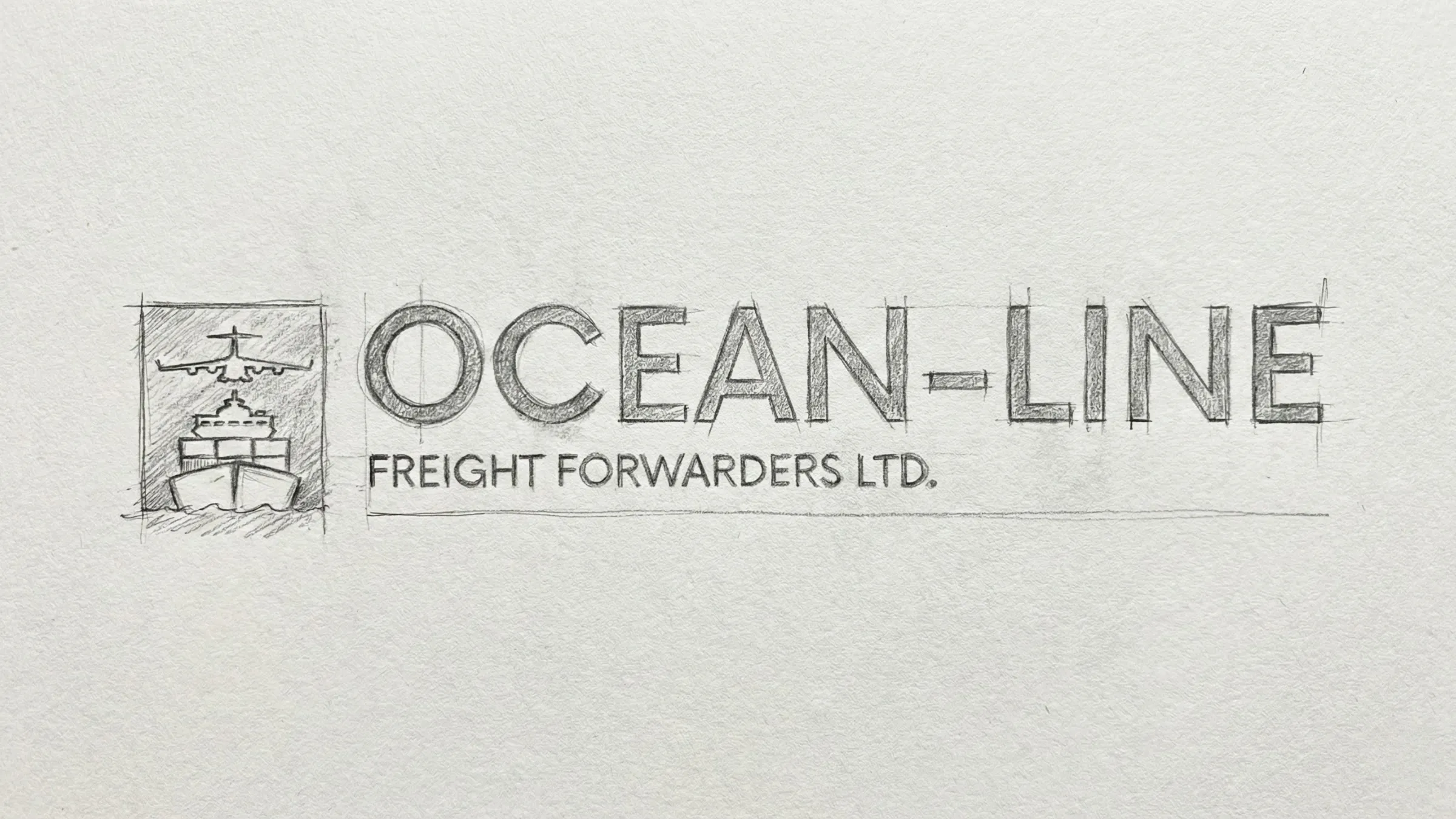
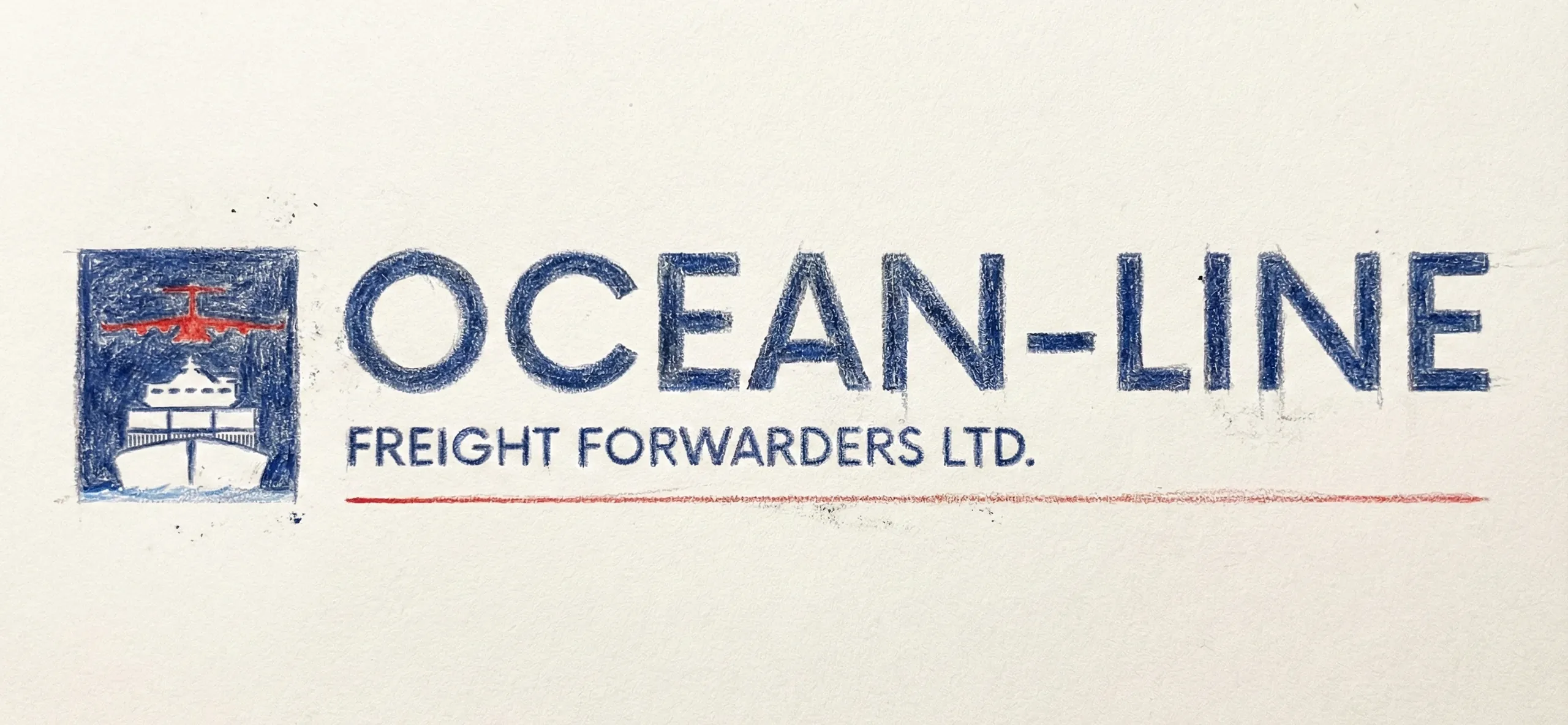
Selection of ultra-bold, condensed "Outfit" typography reflects the industrial nature of freight while maintaining modern digital legibility. The "Horizon" color palette—centering on "Abyssal Blue" and "Oceanic Cyan"—was tested for visibility against various weather conditions and container textures to ensure a consistent global signature.
System Architecture
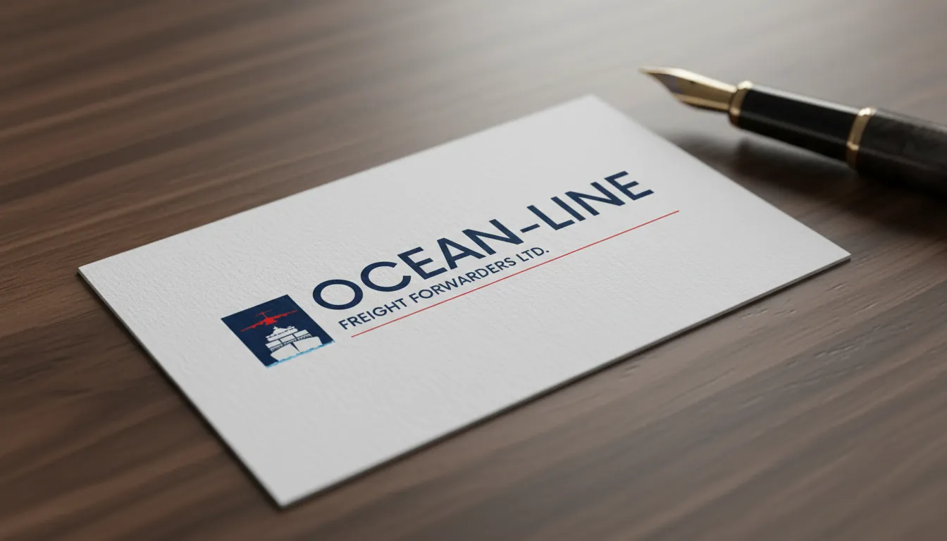
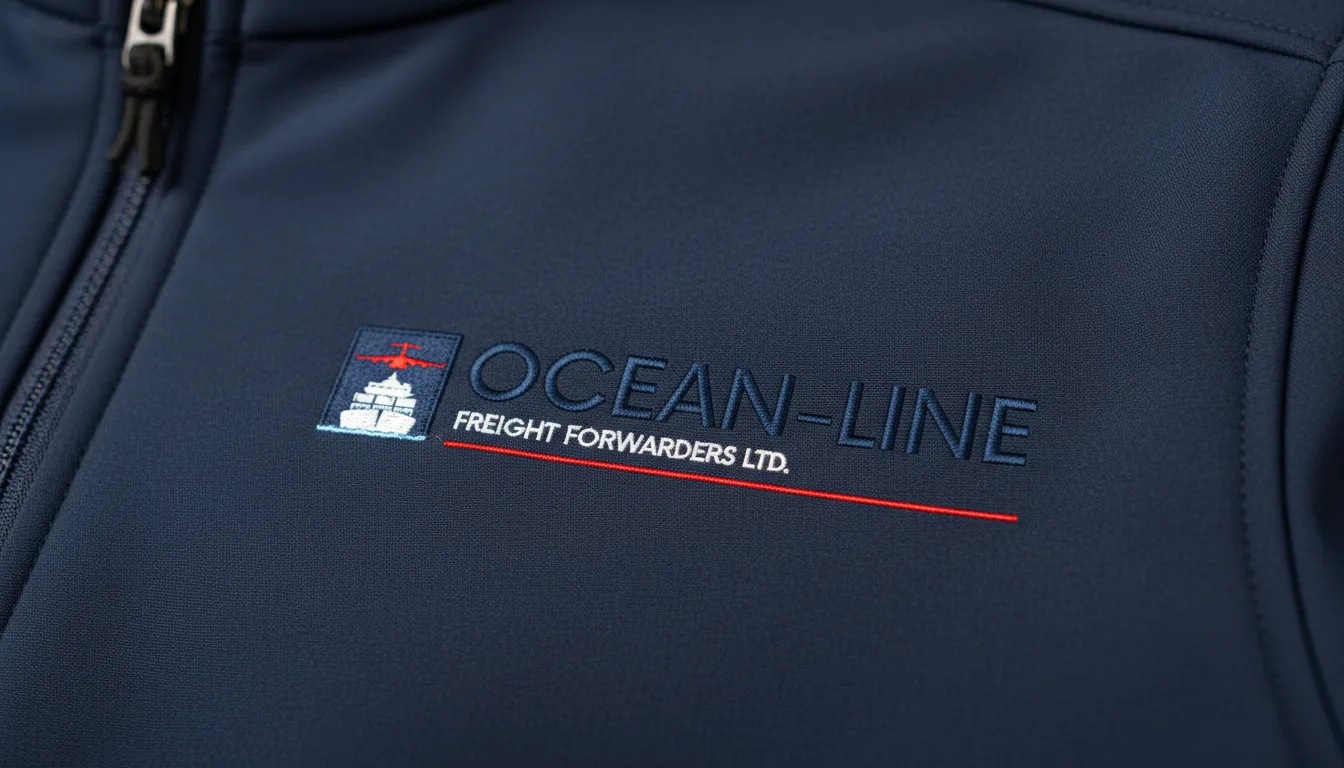
Brand Kit.
AaBb
Outfit Bold (Interactive Lab)
// Fully Custom Typeface: Hand-crafted and digitized directly from original conceptual sketches to ensure a completely unique brand identity.
08. Execution & Deliverables
Proof of Completion
Delivered a unified global brand book, high-visibility container decal specifications, and a responsive web application for real-time freight tracking and client account management.
09. Outcome & Impact
Was It Worth It?
Cross-border contract acquisitions increased by 25% within the first year of the rebrand. Qualitative feedback from tier-1 freight forwarders confirms that the new identity has significantly improved brand trust in international markets.
10. Reflection & Learning
Maturity Signal
Global logistics branding is an exercise in cultural and functional neutrality. This project taught me how to strip away local decorative elements to create a universal signal of stability. My role involved ensuring the brand could speak every language while maintaining a single, powerful voice—a predictable result for a global logistics leader.