Bold Denk Zono Logo Design - Elevating German Apparel Branding
Sector: Fashion & Apparel
Discipline: Logo & Brand Identity Design
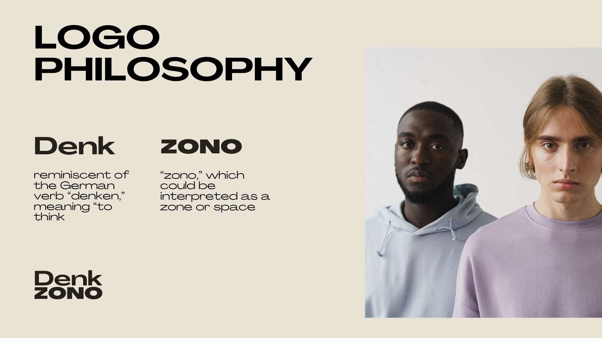
Case Study: Denkzono, a German apparel brand, approached me with a mission to create a logo that embodies their modern and minimalist aesthetic. With over 7 years of experience in logo and brand design, I was excited to tackle this project and deliver a logo that would stand out in the competitive fashion industry while resonating deeply with their target audience.
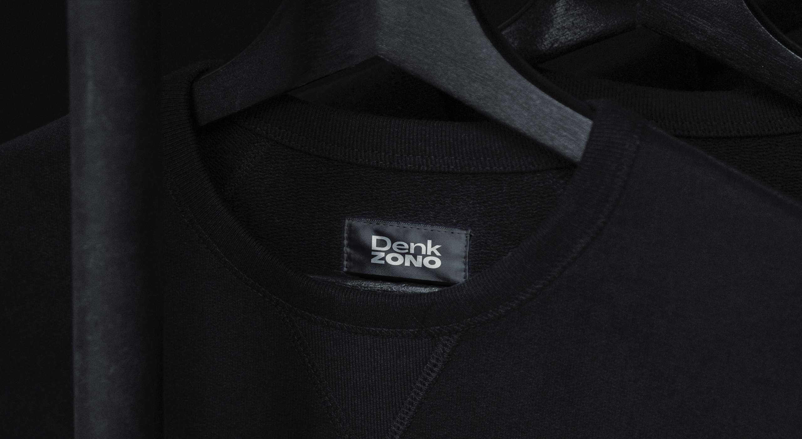
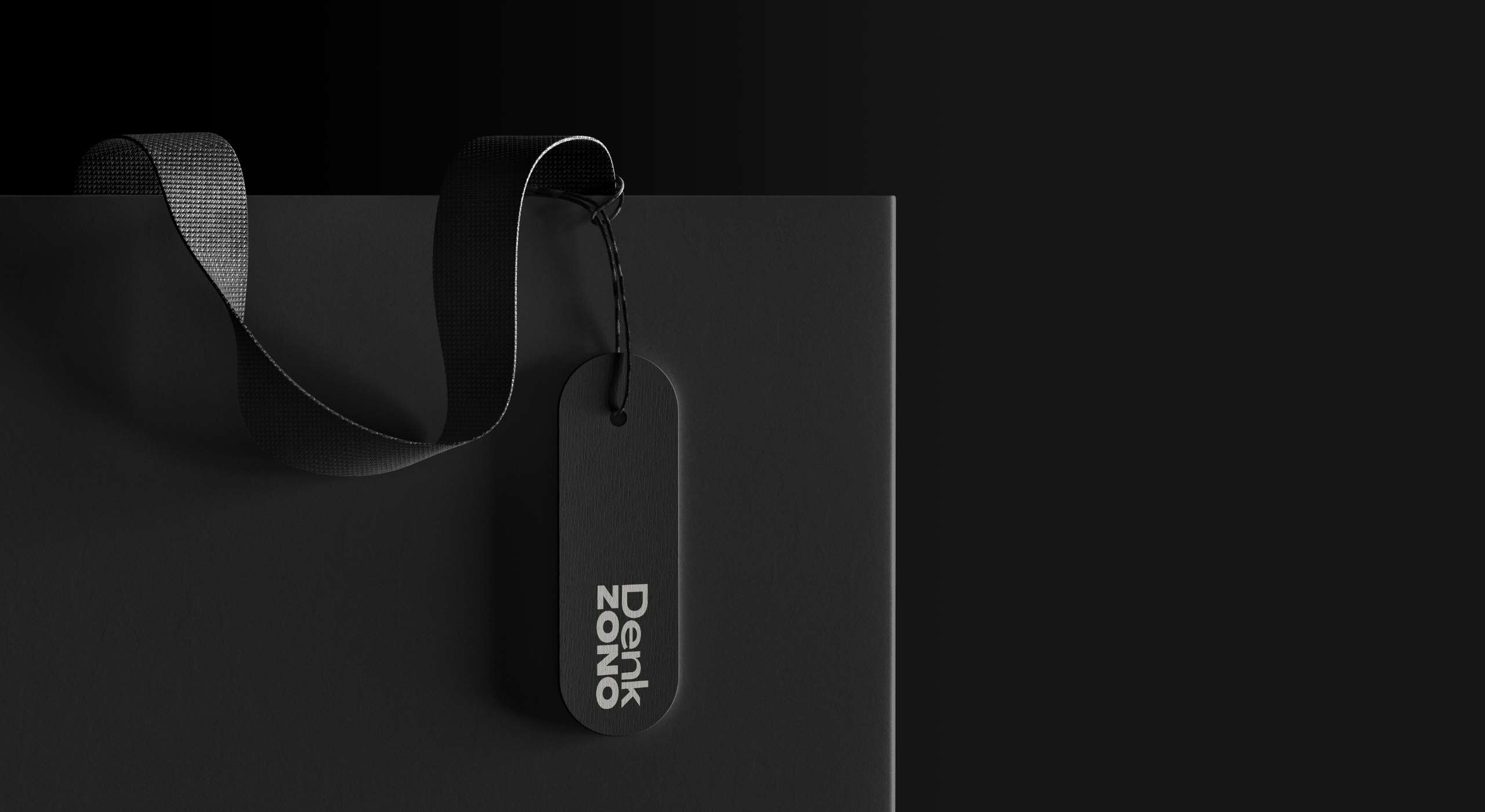
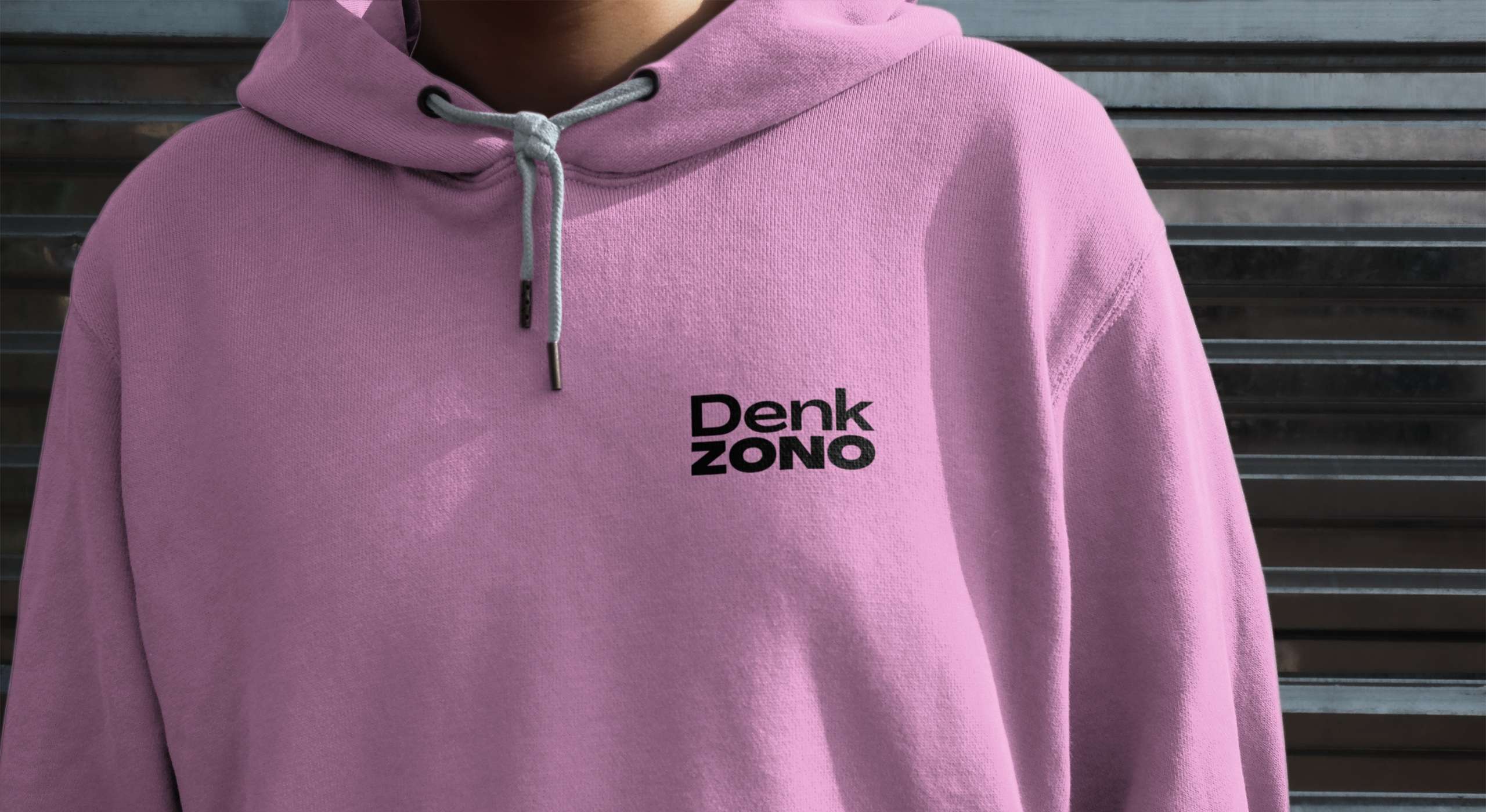
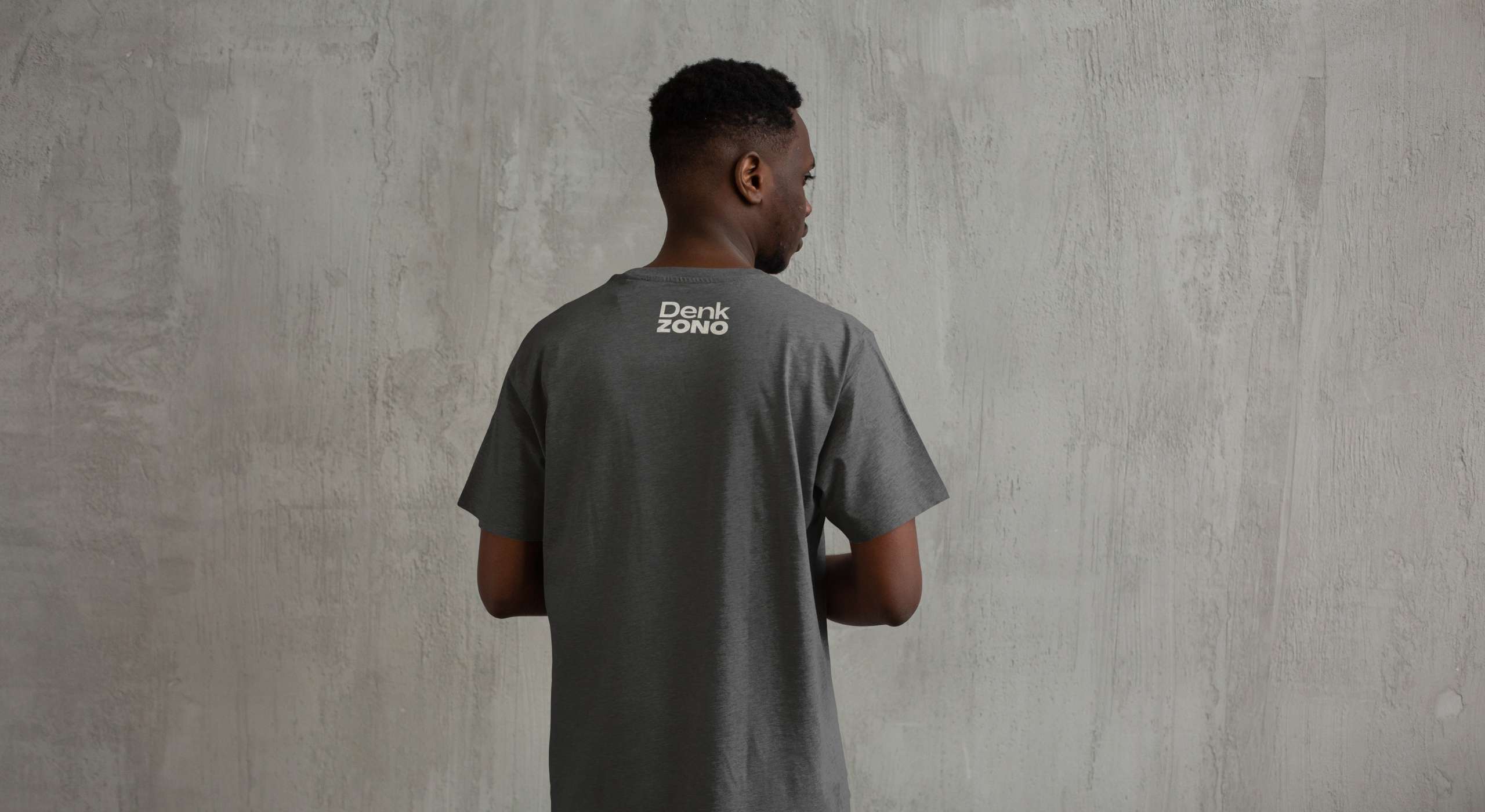
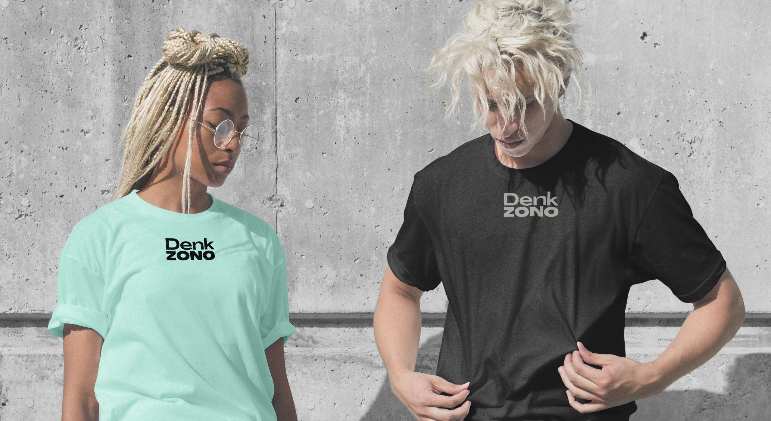
The Challenge: The client required a logo that was clean, bold, and versatile enough to be used across various media, from clothing tags to online marketing materials. The design had to reflect Denkzono’s values of simplicity, quality, and contemporary style. Additionally, the logo needed to be easily recognizable and scalable to ensure it worked effectively in different sizes and formats.
Research and Analysis: I began with an extensive research phase to understand the fashion industry trends, target audience preferences, and the competitive landscape. By analyzing leading competitors and conducting surveys and focus groups with the brand's target audience, I gathered crucial insights. These insights revealed a preference for minimalistic and bold designs that conveyed a sense of modernity and sophistication.
Concept Development: Leveraging the research findings, I brainstormed several concepts that encapsulated the brand’s ethos. Initial sketches focused on typography and geometric forms to maintain a minimalist aesthetic. Among the various ideas, a bold, sans-serif typeface emerged as the frontrunner due to its modern and timeless appeal. I created mood boards to visualize how different concepts would appear across various applications.
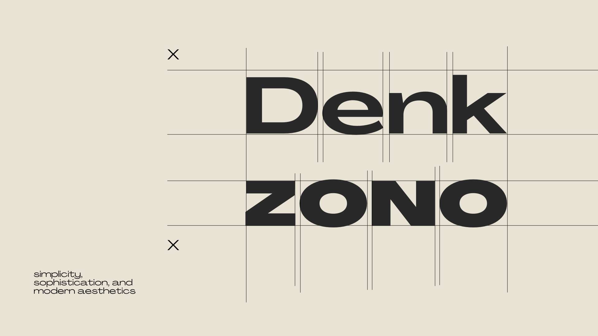
Design Execution: After presenting the initial concepts to the client, we decided to refine the typography and explore different layouts. The client favored a strong, bold look, leading me to experiment with various font weights and spacing to achieve the perfect balance. Through several iterations and rounds of feedback, we refined the design to align perfectly with Denkzono's vision.
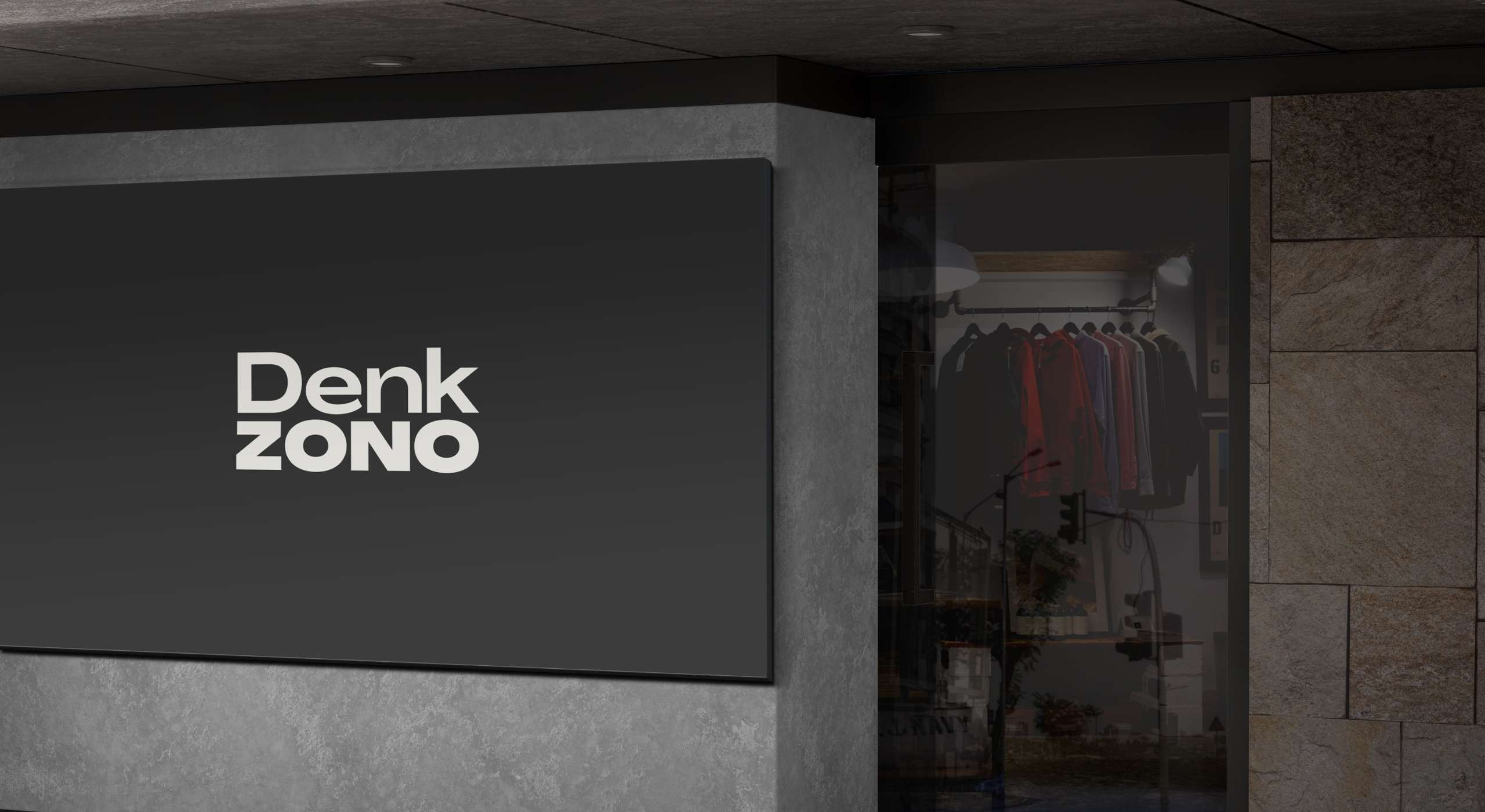
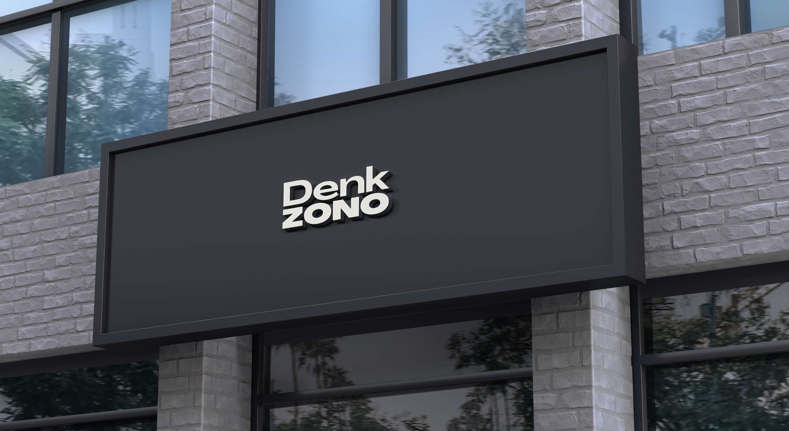
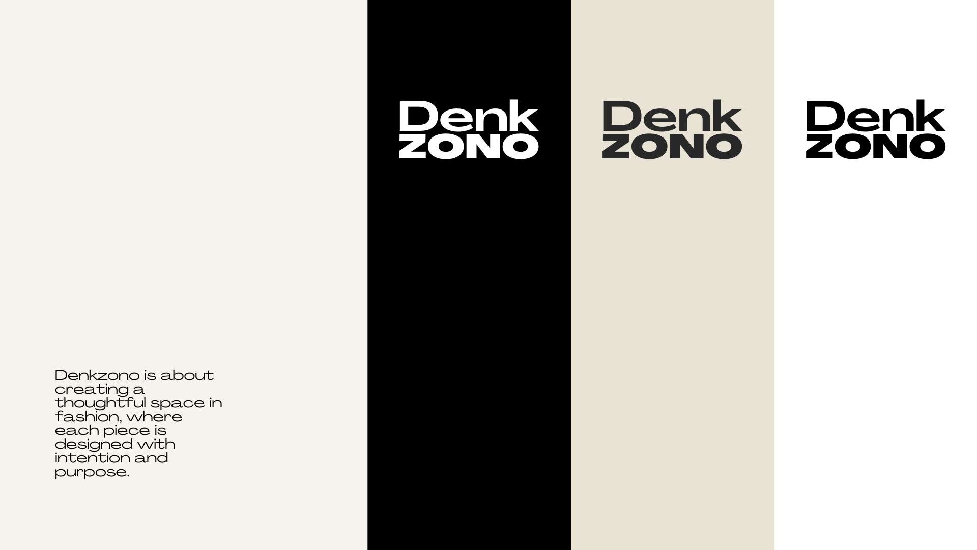
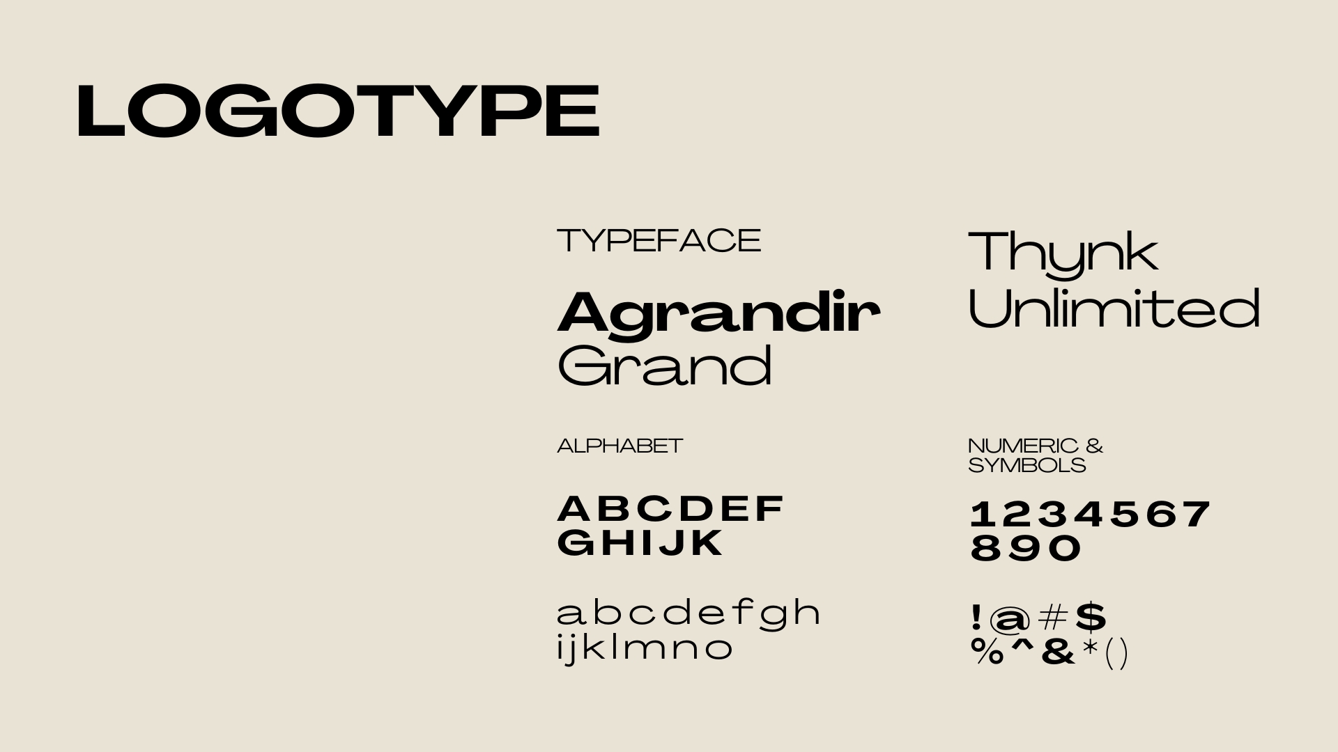
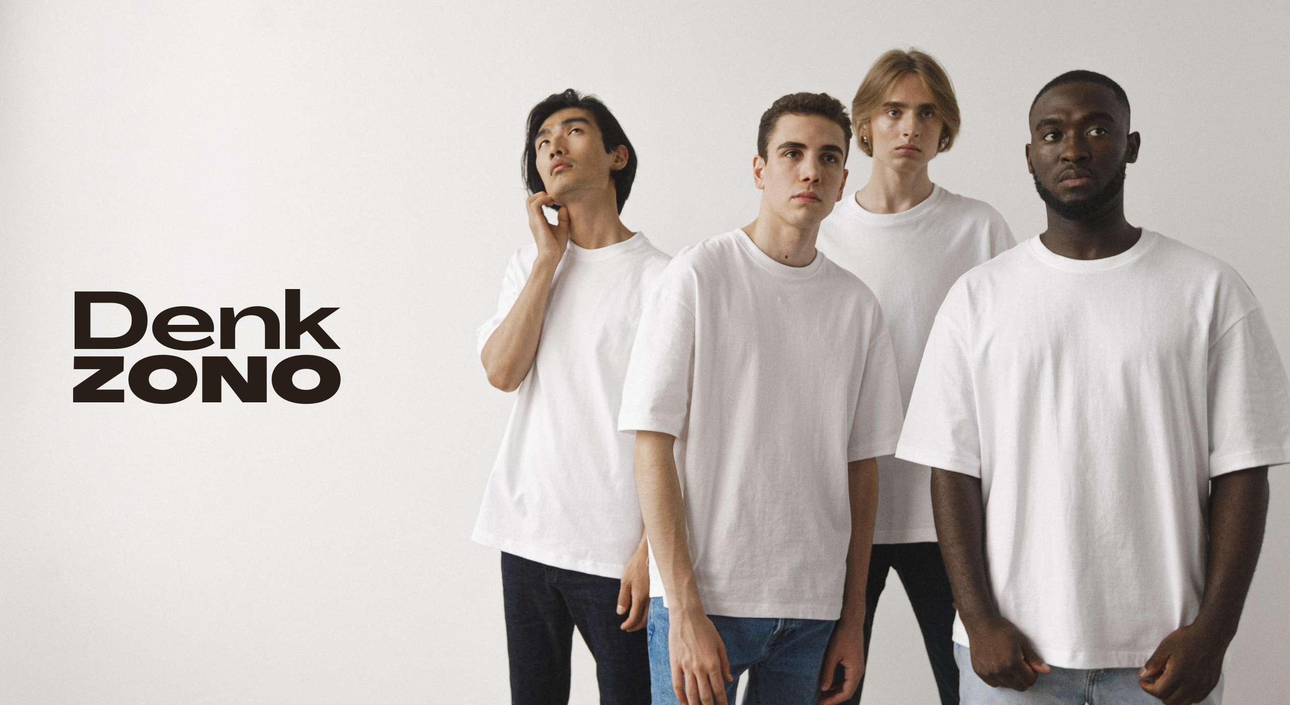
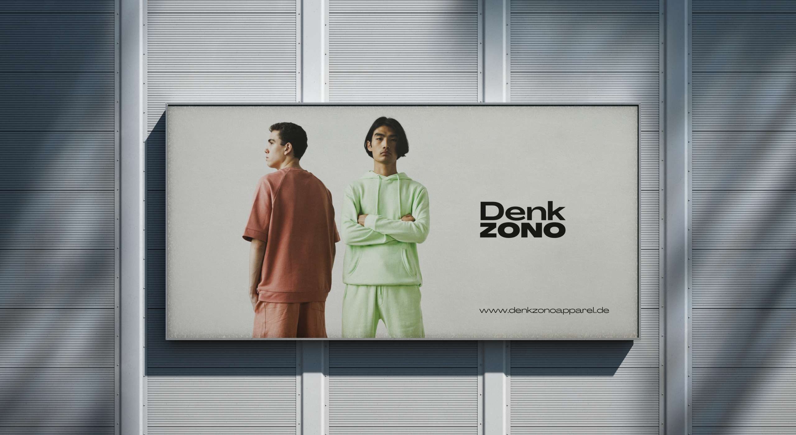
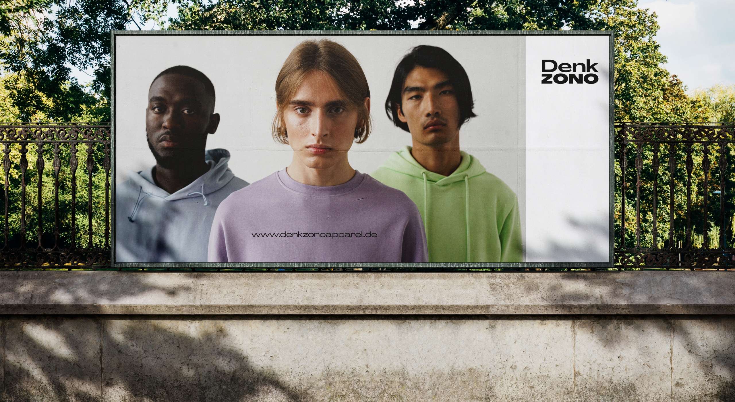
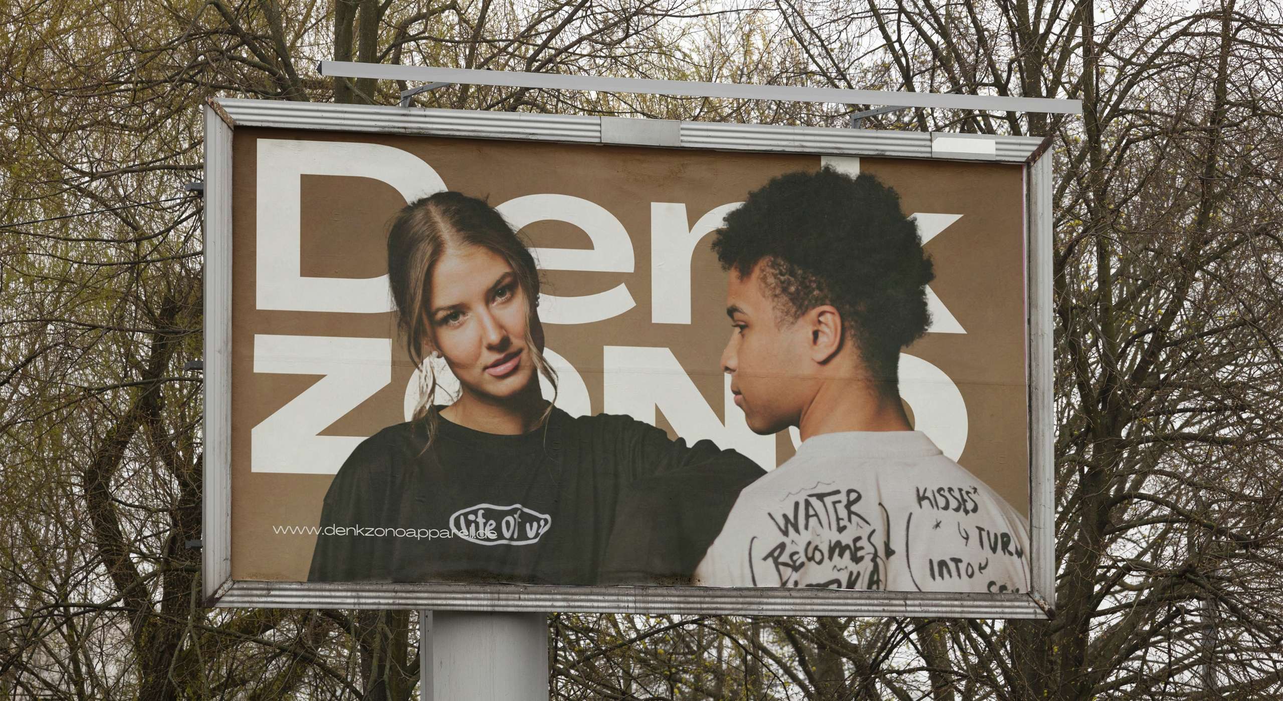
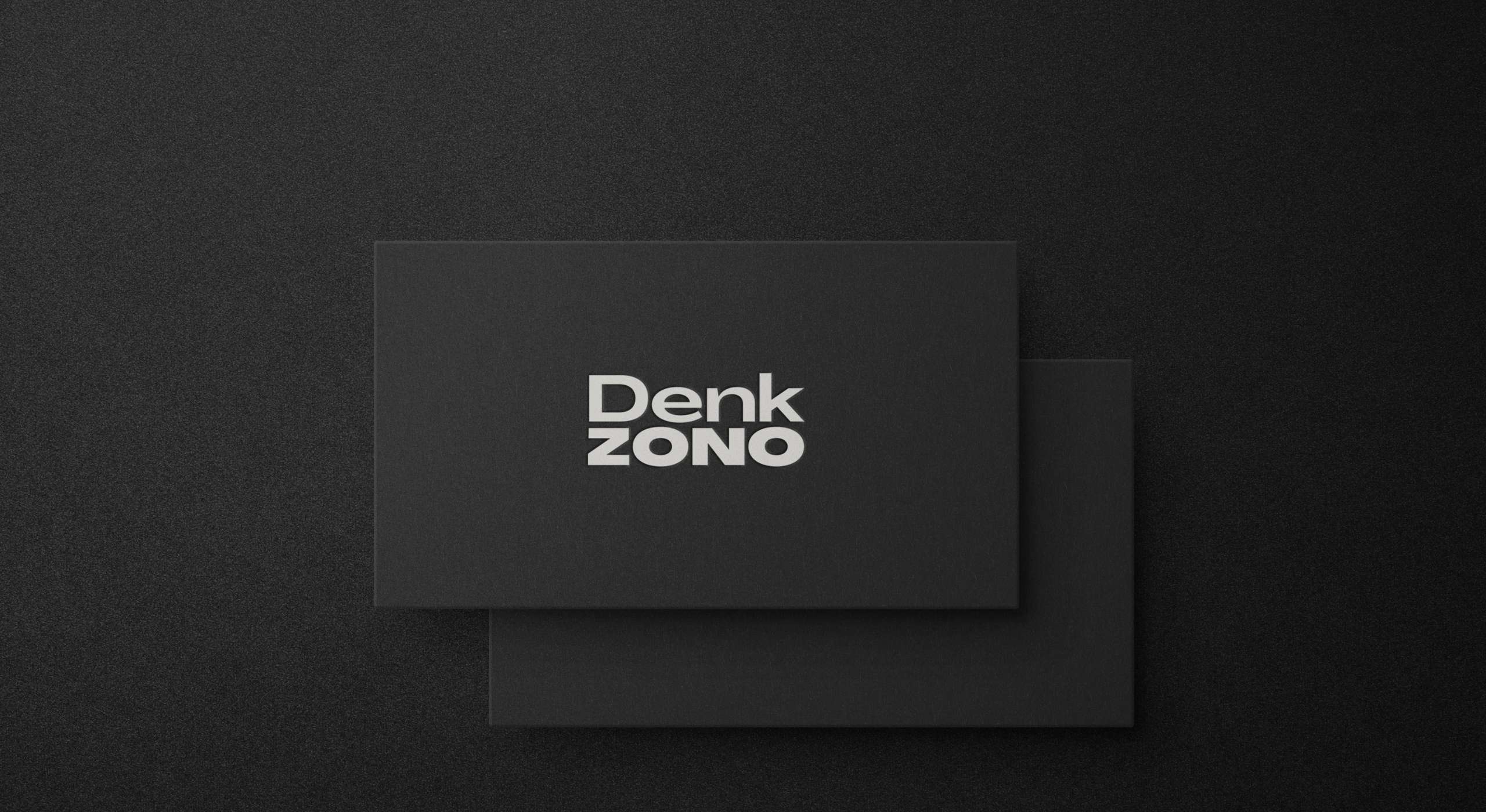
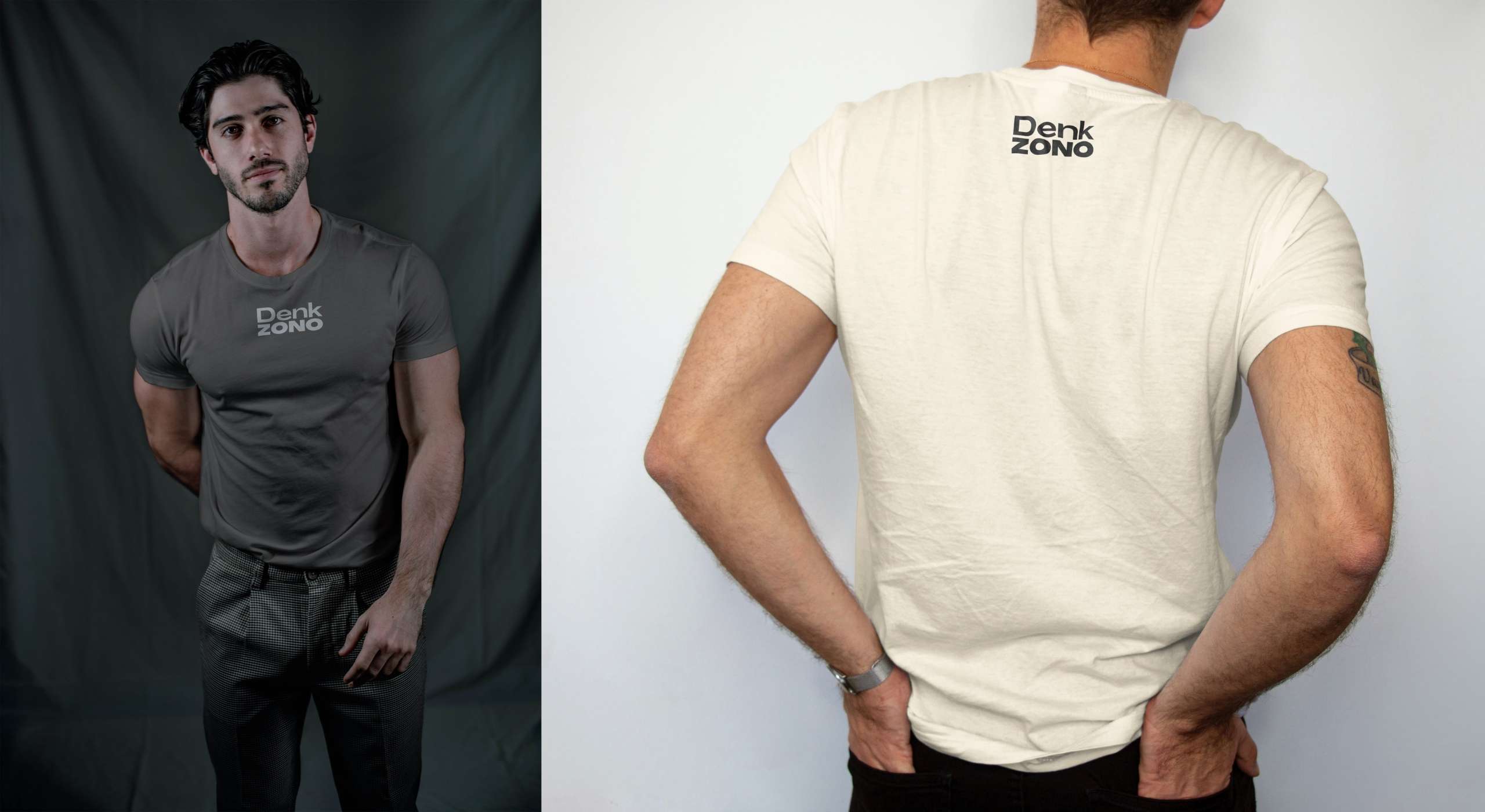
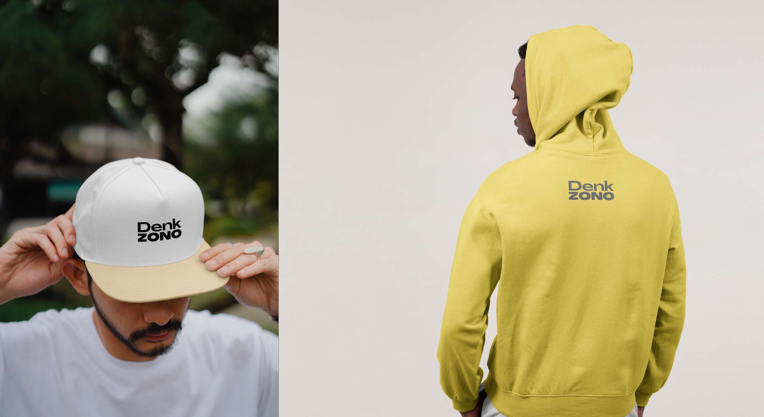
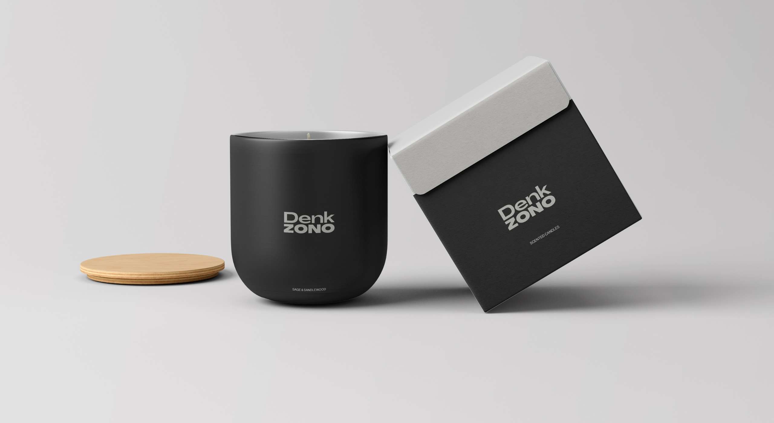
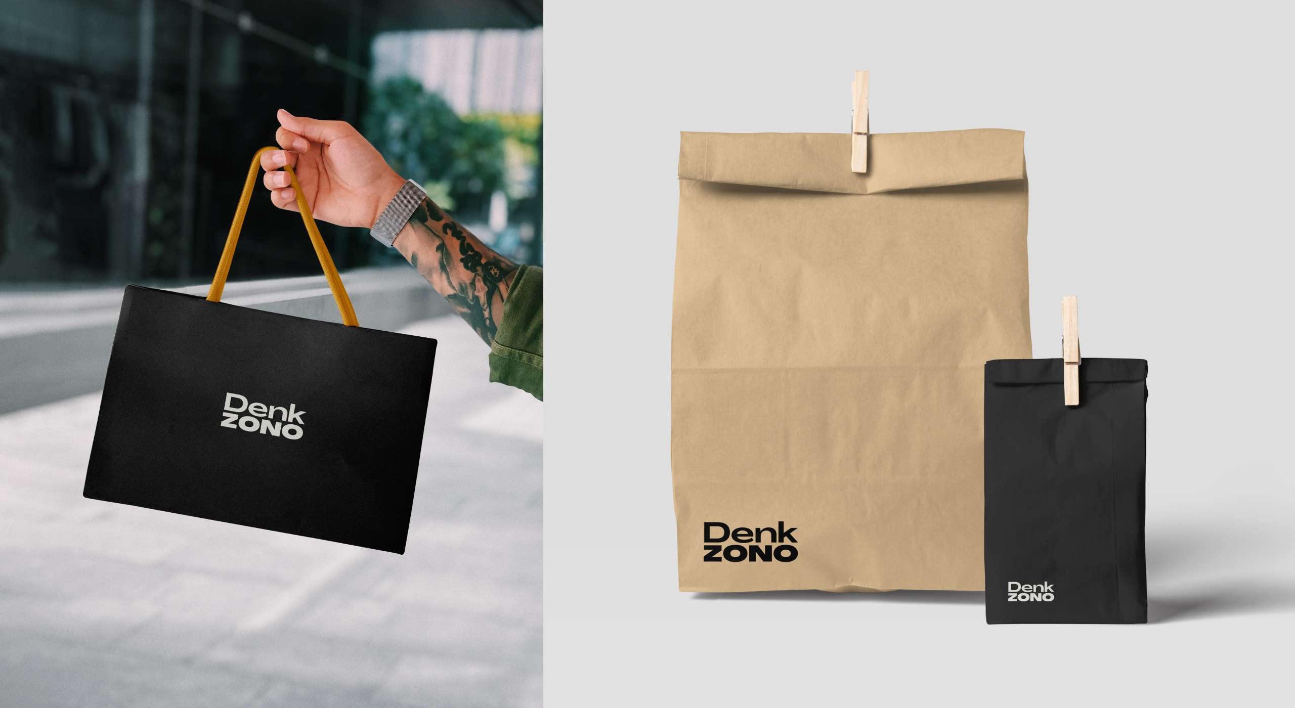
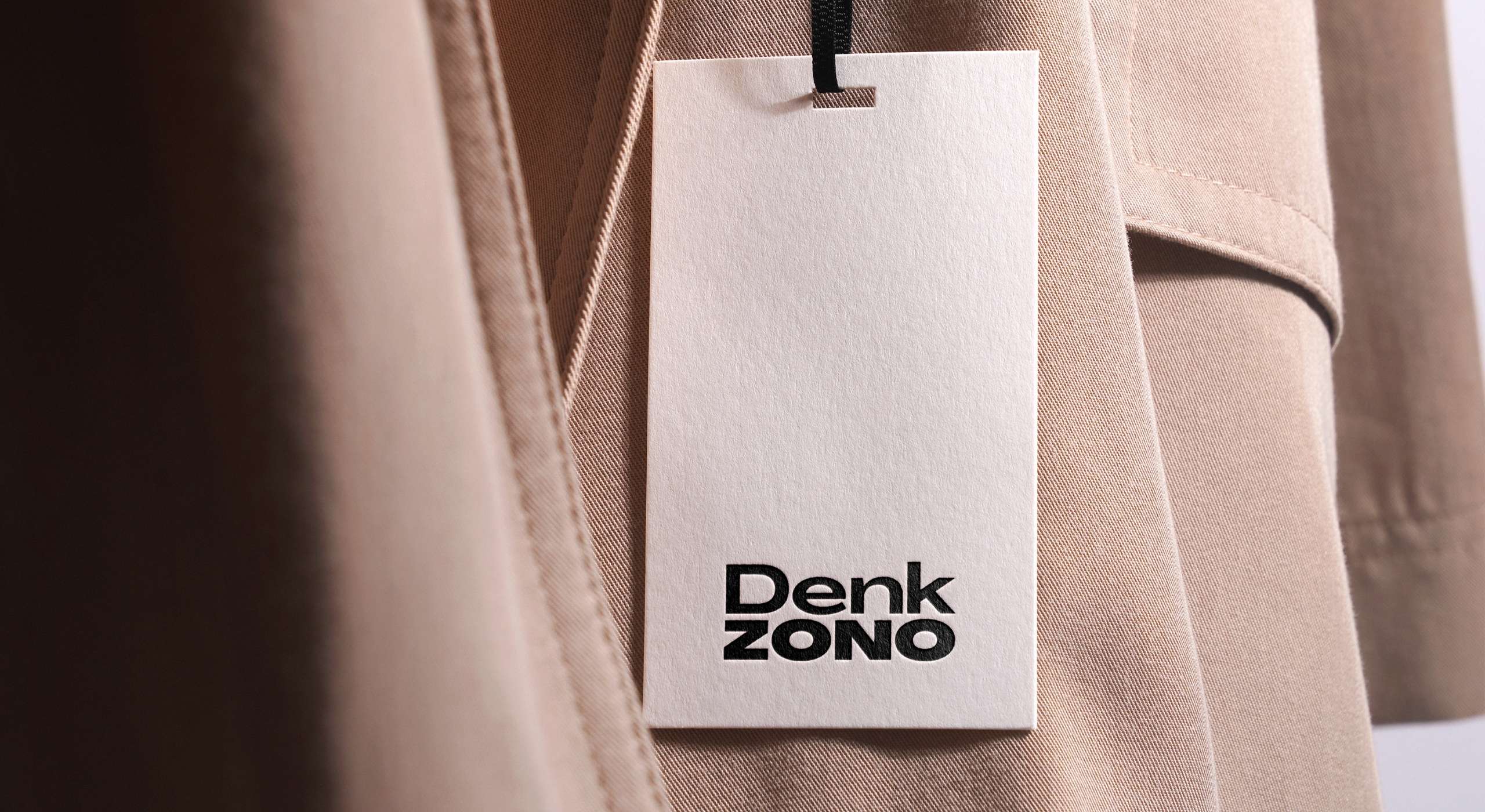
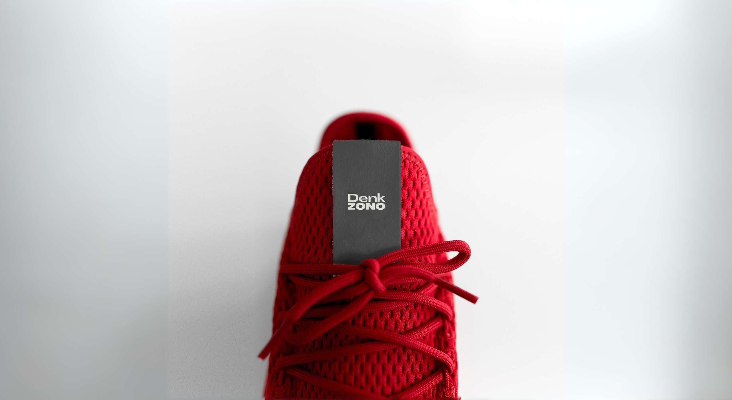
Final Solution: The final logo features a custom sans-serif typeface with clean lines and balanced proportions. The bold typography ensures high visibility and recognition, while the minimalist design aligns with Denkzono’s modern aesthetic. The logo's simplicity allows it to be easily scalable and versatile for various applications, from print to digital.
Impact and Results: The Denkzono logo received positive feedback from both the client and their customers. It successfully established a strong brand identity and increased brand recognition. The logo’s versatility allowed it to be seamlessly integrated across all marketing channels, contributing to a cohesive and professional brand image.
Conclusion: This project was a rewarding experience that showcased my ability to create a strong brand identity through thoughtful design. By focusing on simplicity and versatility, I delivered a logo that not only met but exceeded the client's expectations. This case study exemplifies my problem-solving skills and commitment to delivering high-quality design solutions.
