Revamping Kuku Nation's Flavor: A Fresh Logo for Nairobi's Beloved Chicken Spot

Sector: Food & Beverage
Discipline: Logo & Brand Design
Project Overview: Kuku Nation is a local chicken and chips restaurant seeking a fresh and distinctive logo to establish a strong brand identity. The previous logo lacked character and failed to resonate with the target audience. The goal was to create a visually appealing, memorable logo that reflects the brand's personality and appeals to its customers.
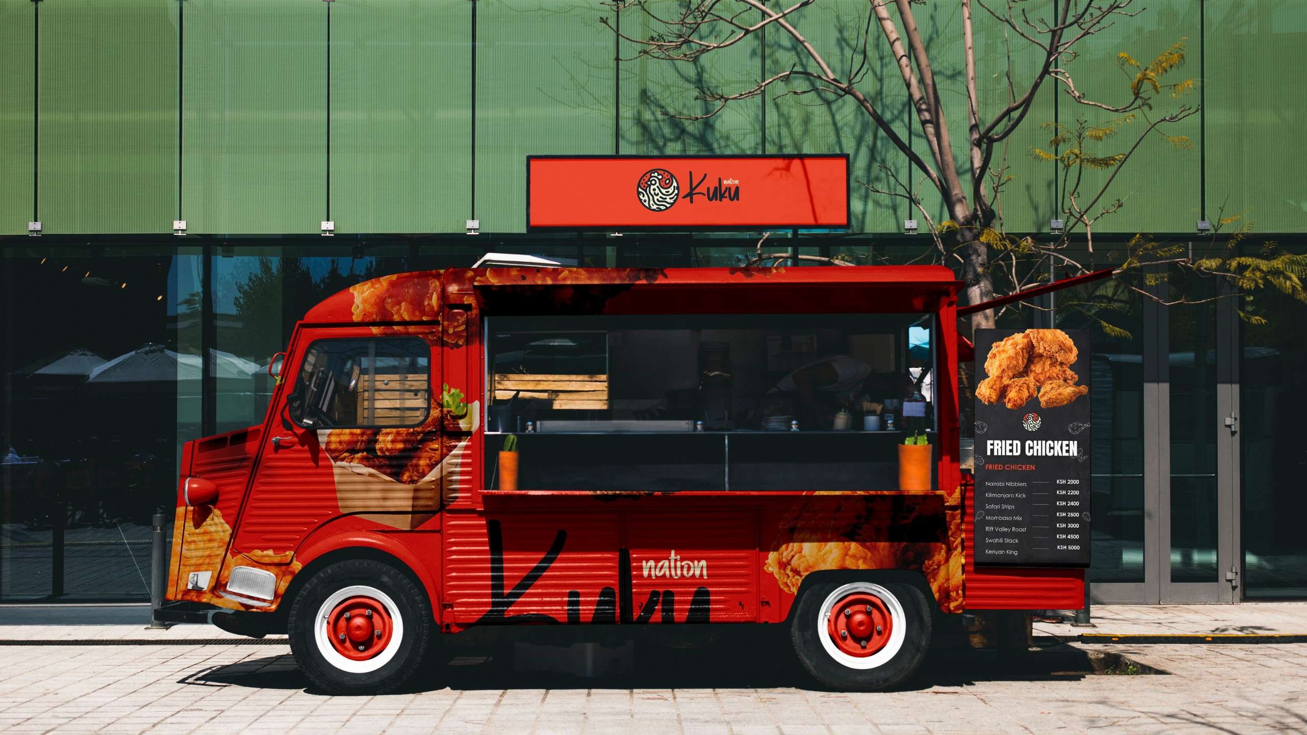
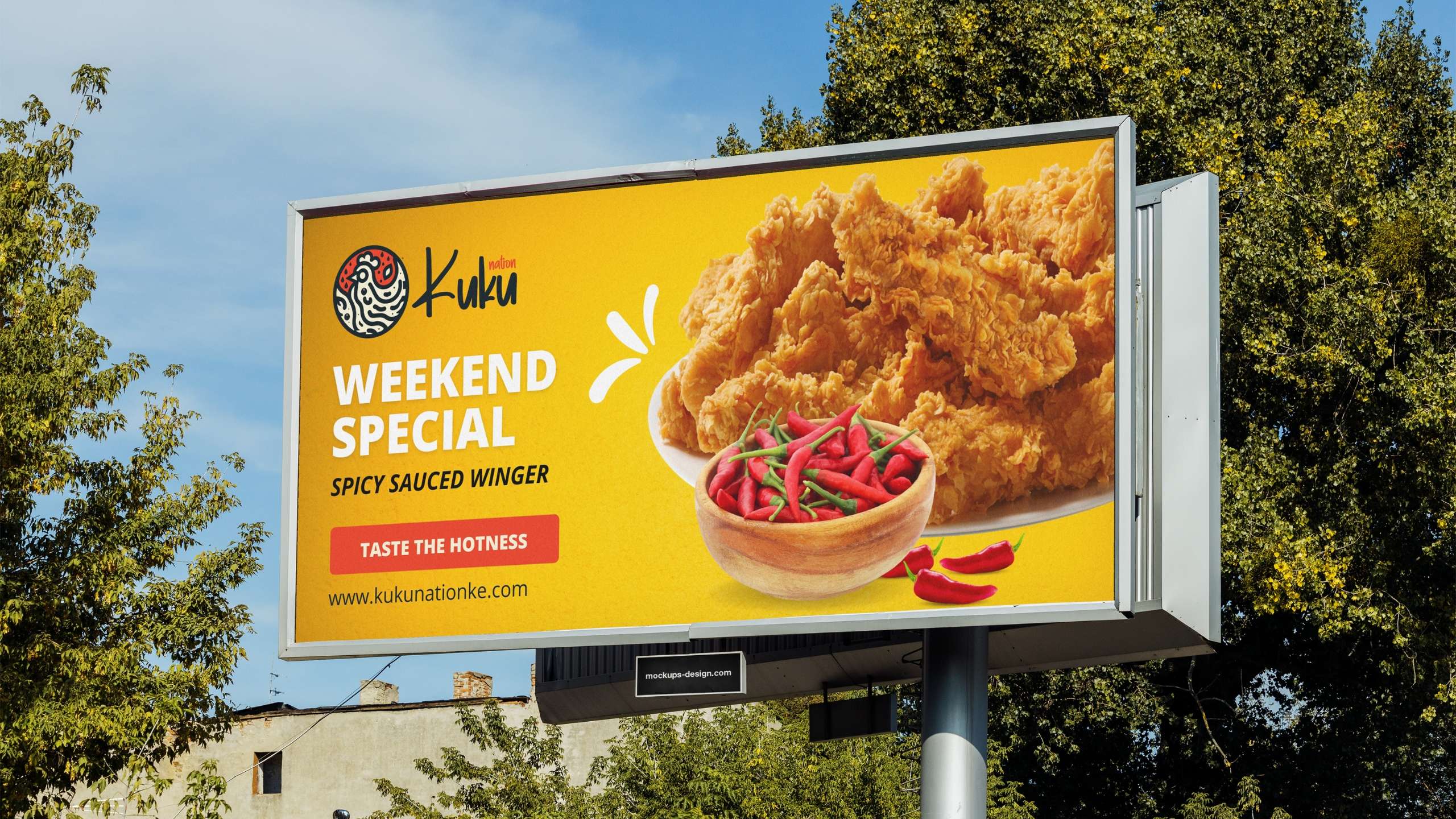
Design Challenge: The primary challenge in designing a logo for Kuku Nation was to create a design that not only captured the essence of their offerings but also stood out in a competitive market. The logo needed to be versatile enough for various applications, from signage to packaging, while maintaining readability and impact across different sizes and mediums. To begin the redesign process, I conducted extensive research to understand Kuku Nation's brand values, target audience, and competitive landscape. This research emphasized the brand's values of quality, taste, and a fun, inviting atmosphere. The target audience was identified as families, young adults, and local food enthusiasts. Additionally, I analyzed the logos of other local and national chicken and fast-food restaurants to identify common themes and gaps in the market. This comprehensive approach ensured the logo design was well-informed and effectively represented Kuku Nation.
Concept Development: Based on the research, I brainstormed and sketched multiple concepts, focusing on elements that symbolize freshness, fun, and the restaurant's specialty – chicken. The goal was to incorporate these elements into a simple yet striking design.
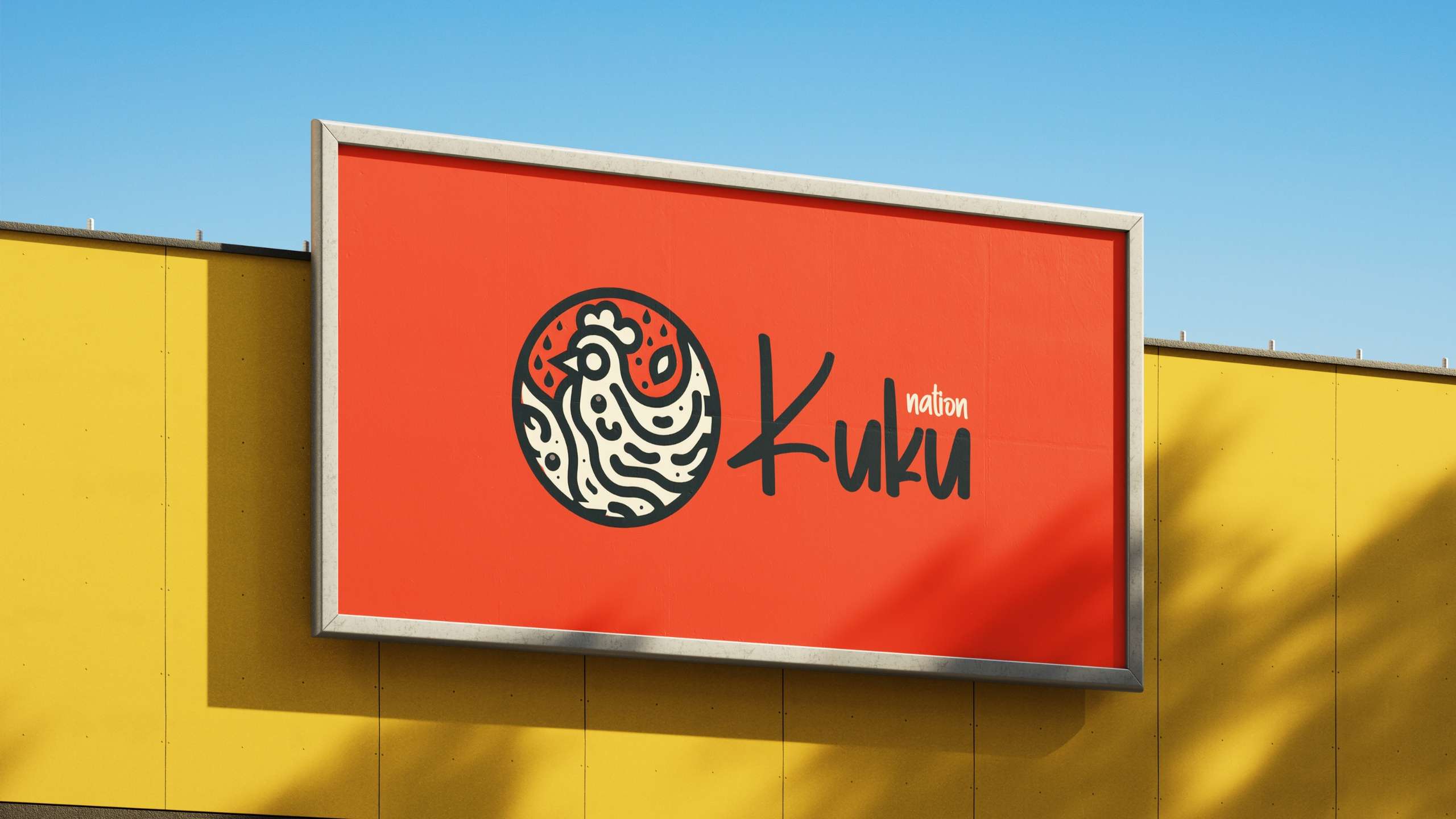
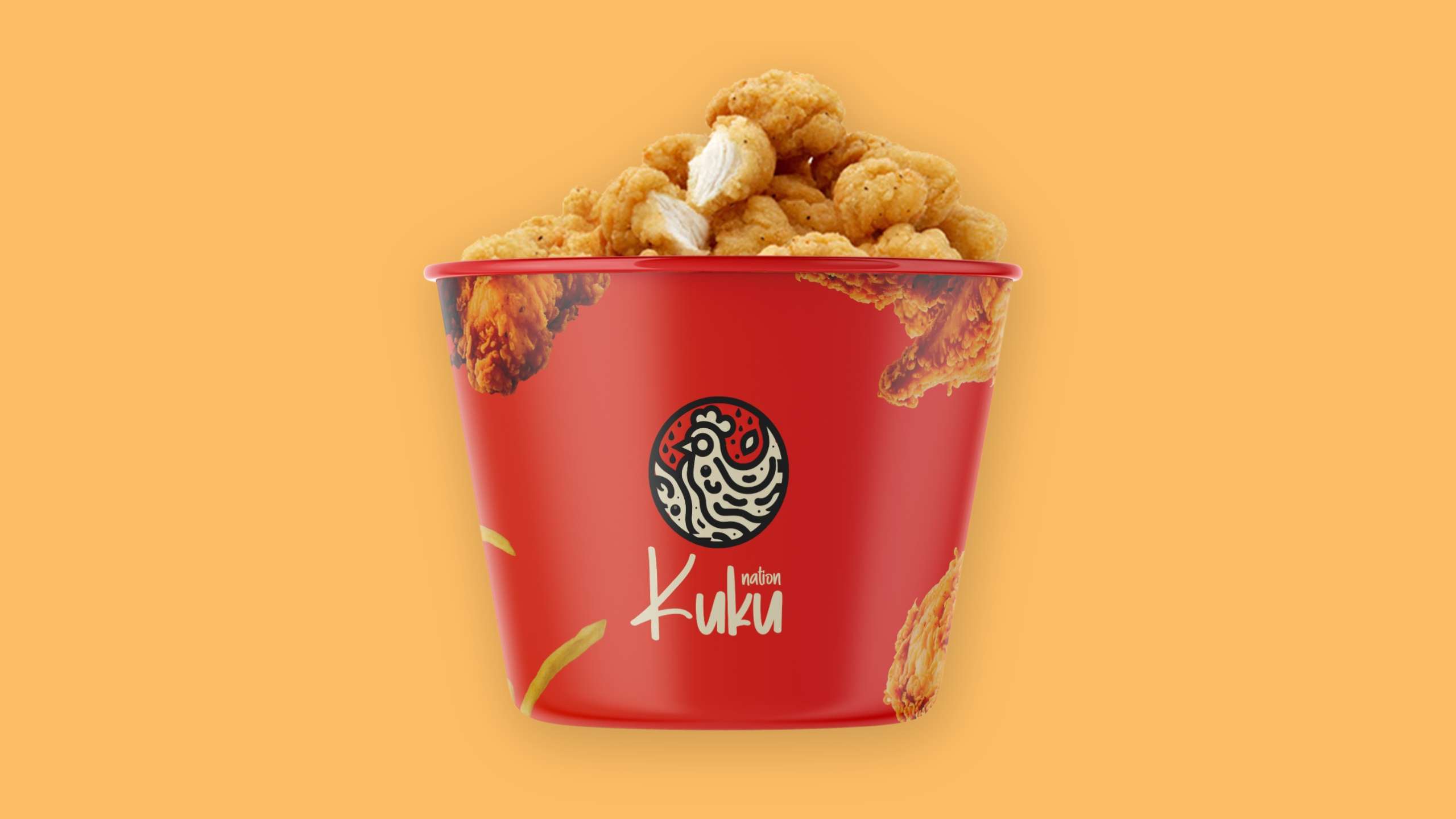
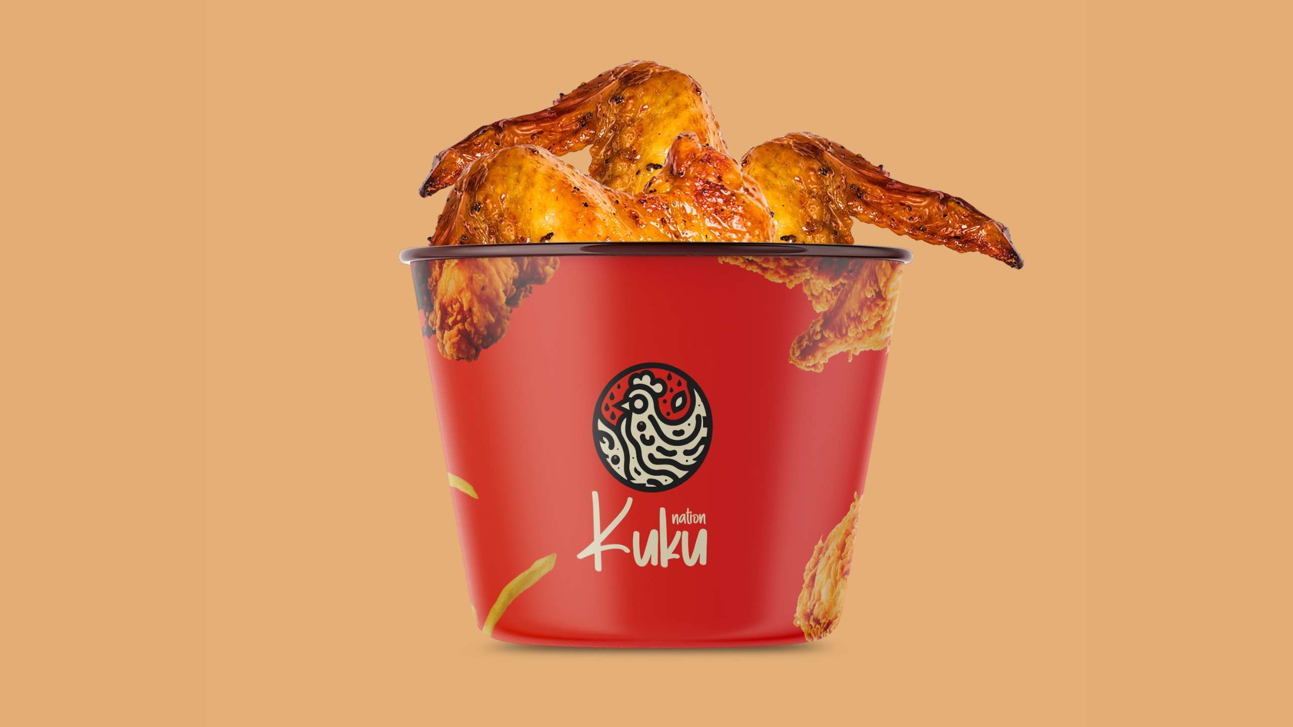
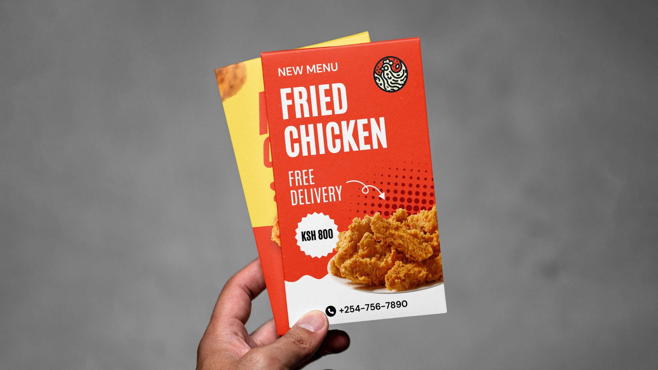
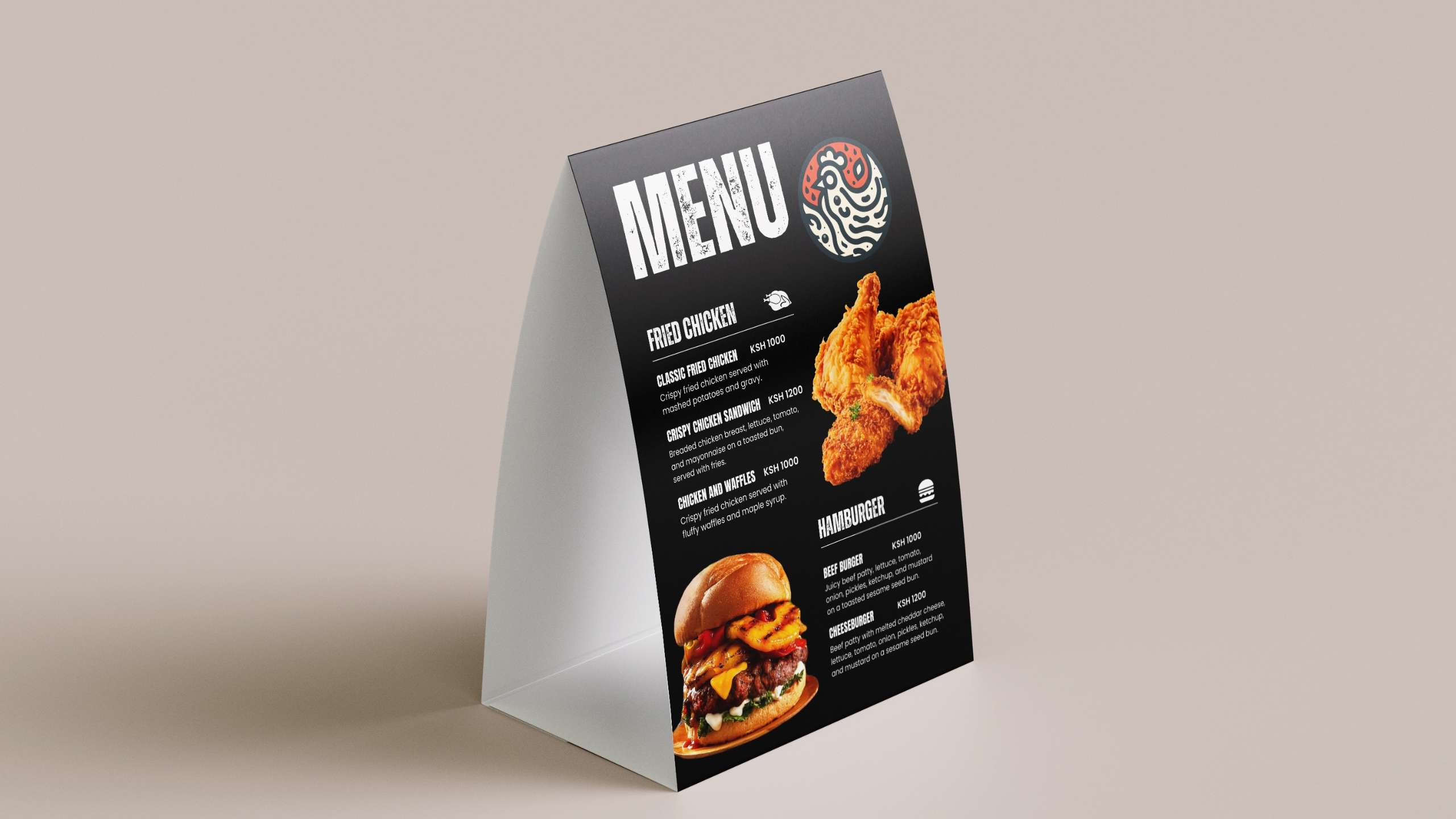
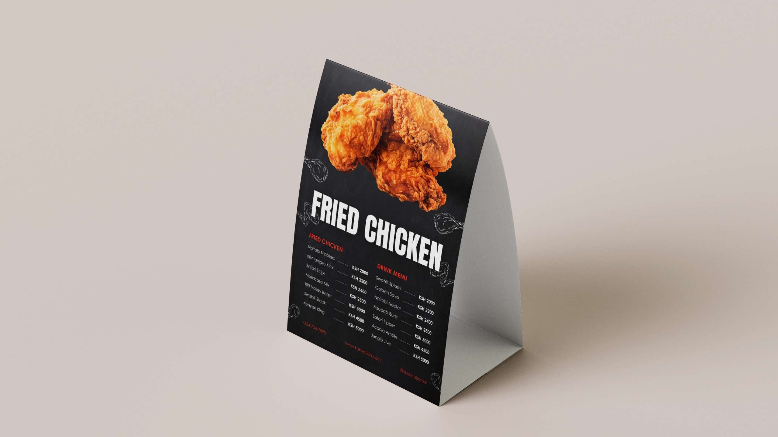
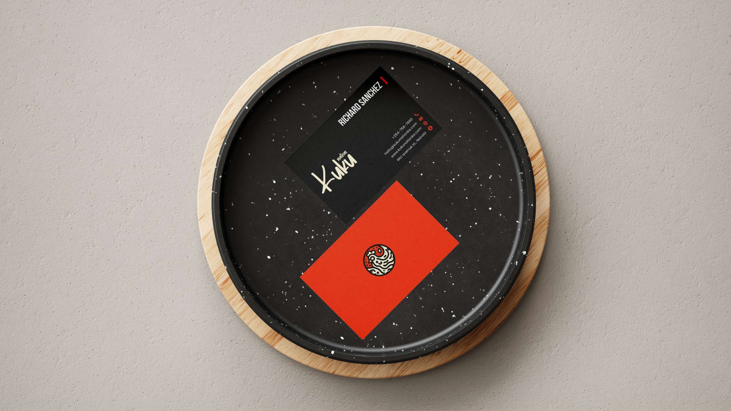
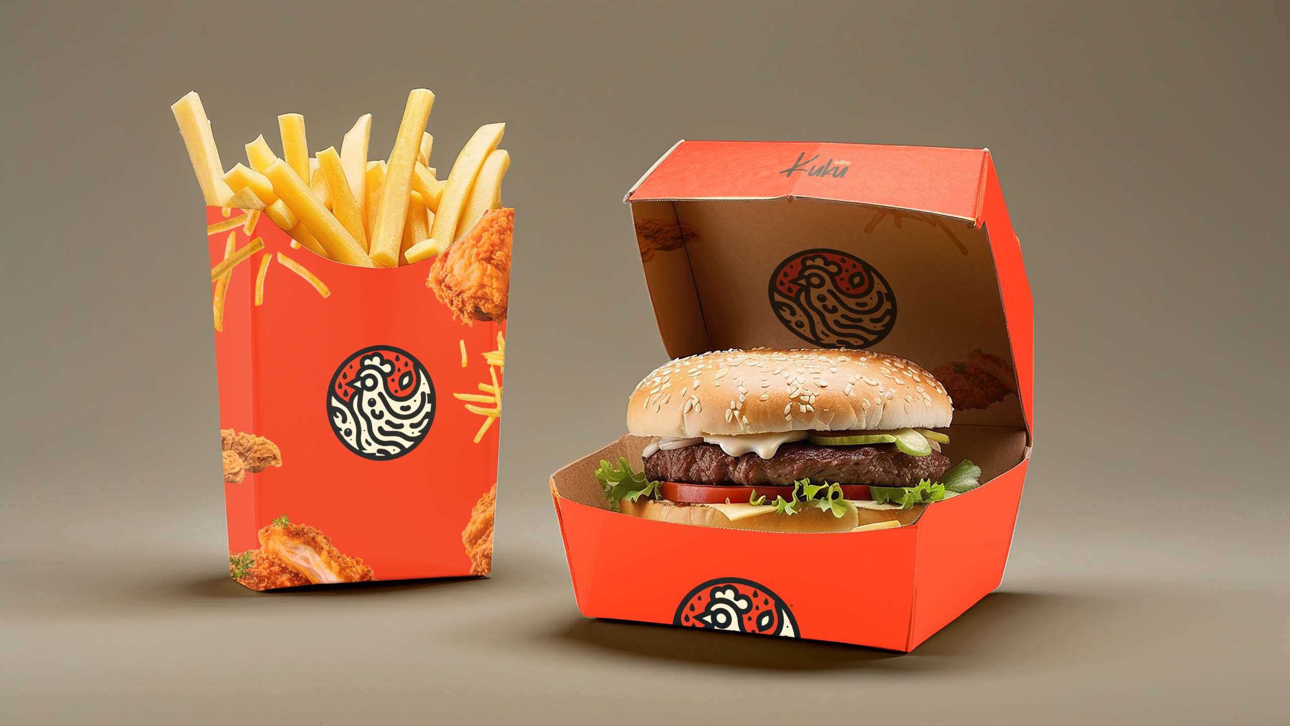
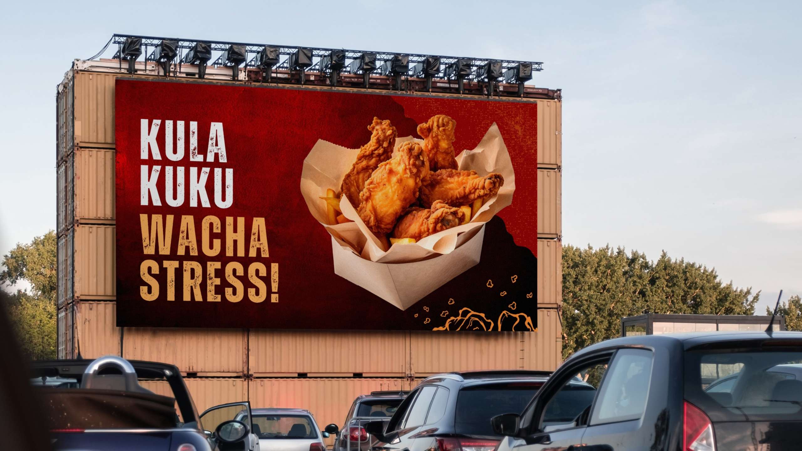
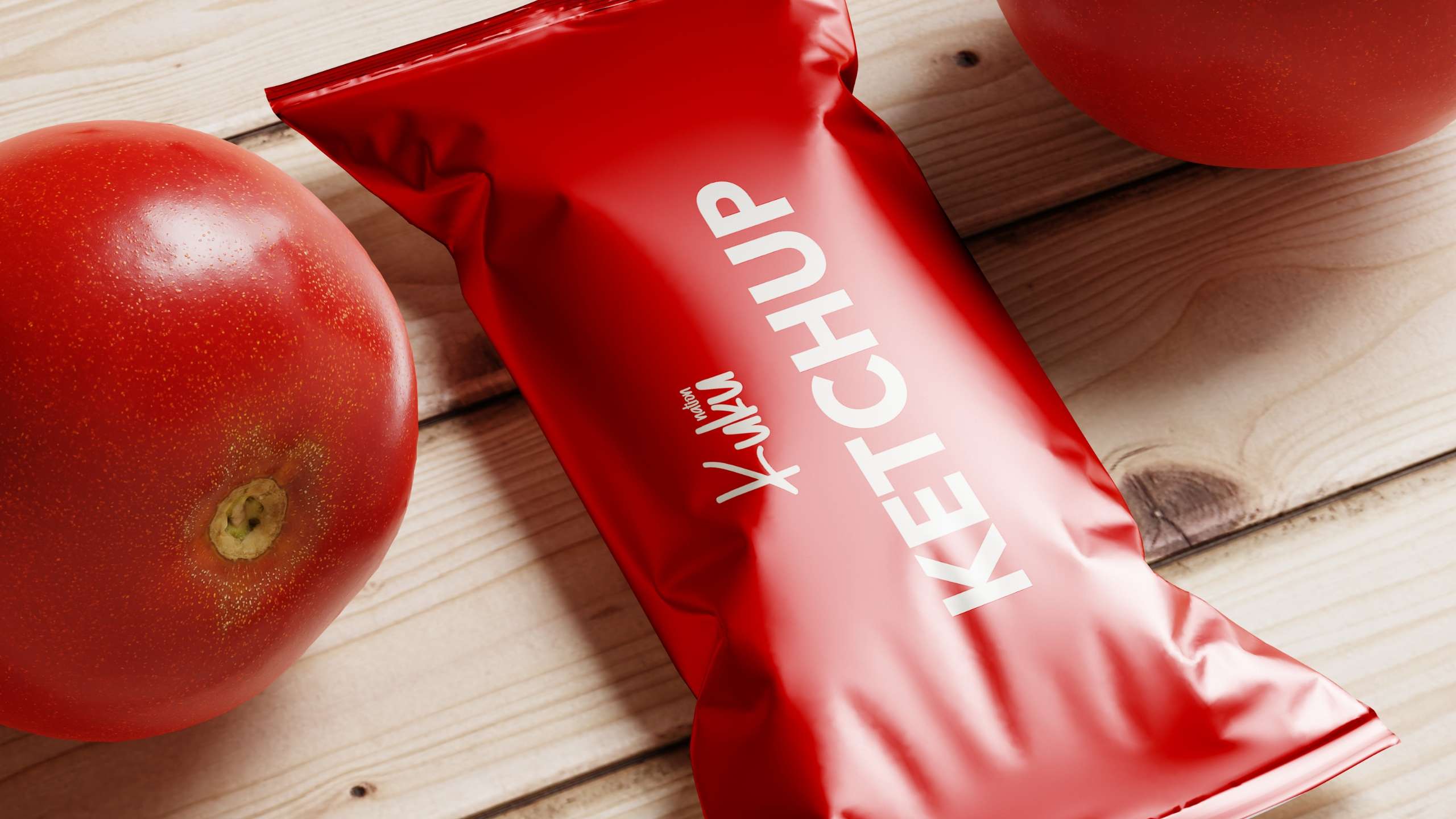
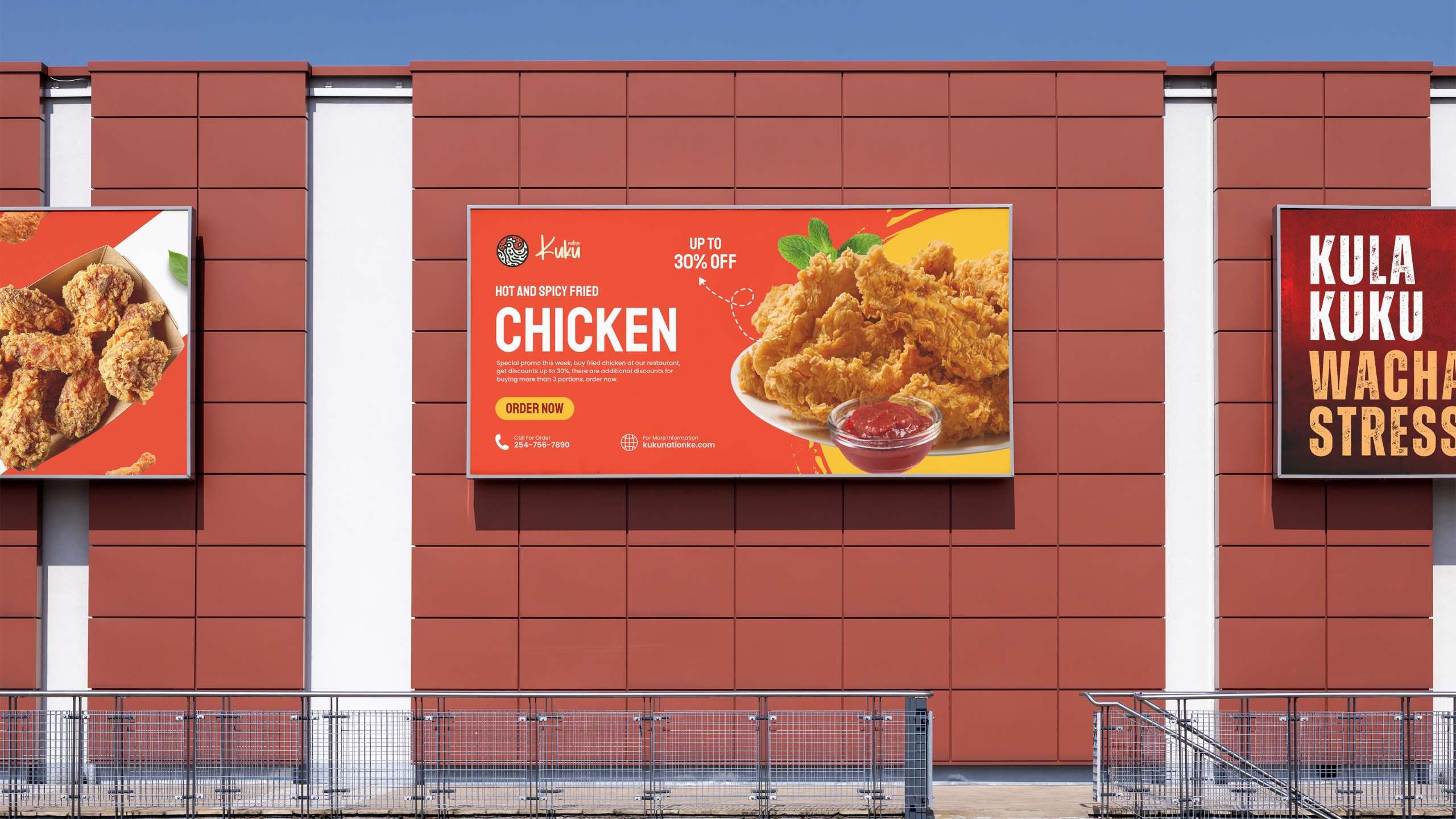
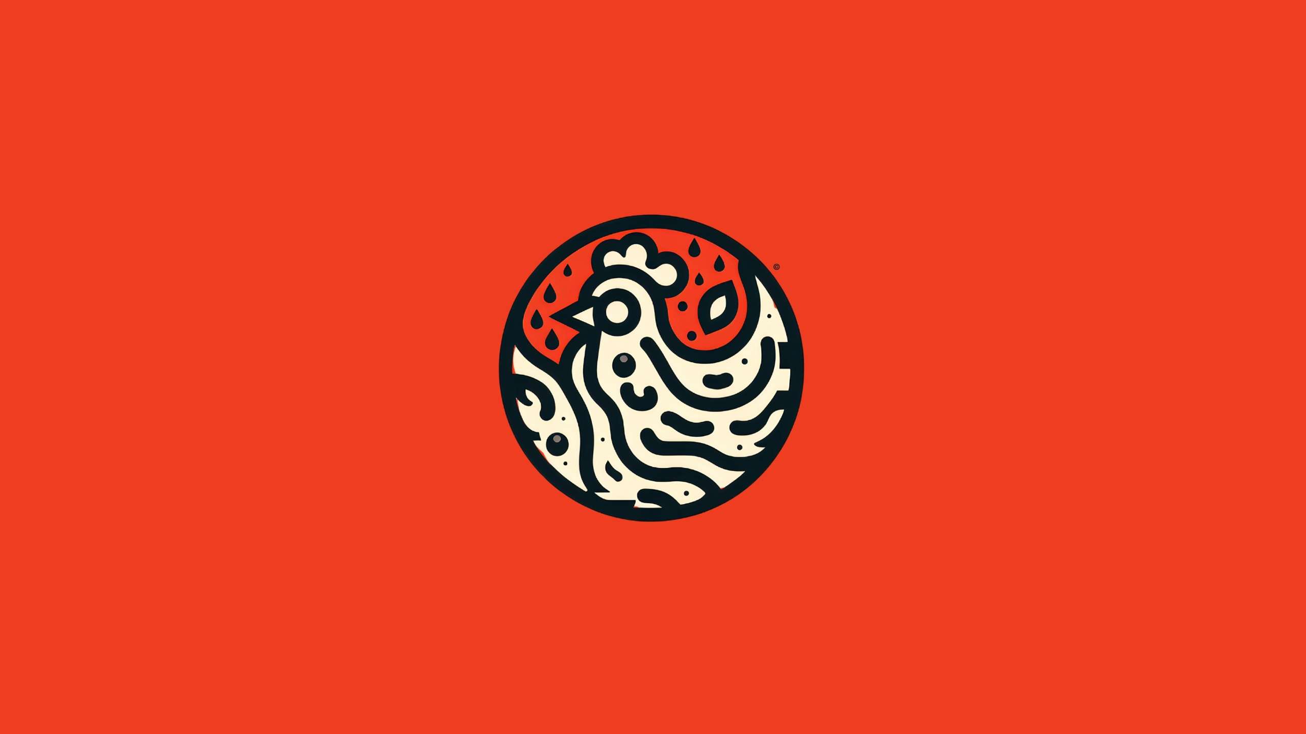
Design Execution: The design execution for Kuku Nation's logo began with hand-drawn sketches, focusing on creating a playful and recognizable chicken mascot. These sketches were then translated into a digital format using Adobe Illustrator, refining the lines, shapes, and overall composition for a professional look. A bold and appetizing color palette of warm tones like red and yellow was chosen, with the addition of black and white for contrast and versatility. The typography was selected to complement the mascot, using a playful and modern font that is easy to read, with the word "nation" styled in a smaller, contrasting font to emphasize "Kuku". After several iterations and feedback rounds, final adjustments were made to ensure the logo's scalability and readability, including fine-tuning the line weights and spacing. The final logo features a charming chicken mascot enclosed in a circular emblem against a vibrant red background, with custom typography adding a touch of playfulness. The redesigned logo successfully addressed the initial challenges and exceeded the client's expectations, improving brand recognition, increasing customer engagement, and demonstrating versatility across various platforms.
Client Testimonial: "Kuku Nation's new logo has transformed our brand identity. It's fun, recognizable, and perfectly represents what we stand for. We've received numerous compliments from our customers, and it has undoubtedly contributed to our growing popularity. John Obiko's creativity and professionalism were instrumental in bringing our vision to life." - Ruth shiko, Owner of Kuku Nation

